How to Create a Style Guide Your Team Will Actually Use
Learn how to create a style guide that ensures brand consistency. Our guide offers actionable steps on voice, tone, and visual identity for lasting impact.
Dan Benyamin
Sep 13, 2025
In This Article
Subscribe to our newsletter
So you want to build a style guide. What does that actually involve?
At its core, it's about defining your mission and audience, nailing down your brand's voice and visual identity, and then getting all those rules down in a way everyone can actually use. Think of it as your brand's single source of truth. This document is what ensures every single thing you create—from a detailed video script to a quick social media reply—feels like it came from you. It's how you stop brand dilution in its tracks and empower your whole team to create with confidence.
Why Your Brand Needs a Style Guide, Like, Yesterday
Before we jump into the "how-to," let's get real about the "why." A style guide is so much more than a stuffy rulebook; it's your brand's north star. It’s the foundational document that gets everyone, from the marketing intern to the lead video editor, speaking the same language.
Without one, you’re basically just guessing. And that guesswork leads to a messy, fragmented brand experience for your audience.
Imagine a potential customer seeing three different versions of your logo in one week. Or reading social media posts that swing wildly from witty and casual to stiff and corporate. It doesn’t just look unprofessional—it actively chips away at their trust. When your messaging is all over the map, people get confused about who you are and what you actually stand for.
The True Cost of Inconsistency
Inconsistent branding creates friction. It’s the little things that make a customer hesitate before clicking "buy" because the fun Instagram ad they just saw feels completely disconnected from the bland, corporate product page they landed on. That disconnect can lead directly to lost revenue and a leaky sales funnel.
On the flip side, the brands that win—the ones you instantly recognize and trust—are obsessive about consistency. Think of the big global players or even your favorite local coffee shop. Their look, feel, and voice are unmistakable. That's not a happy accident; it’s the direct result of a well-defined and consistently enforced style guide. That kind of consistency is what builds powerful brand recall and turns casual customers into loyal fans.
A style guide isn't about killing creativity. It's about building a solid framework so creativity can flourish in the right direction. It gives your team the confidence to move fast without second-guessing every little decision.
Unpacking the Tangible Business Value
The business case for a style guide is crystal clear and totally measurable, impacting both your place in the market and how efficiently your team works.
In fact, solid brand documentation can boost brand recall by up to 70%, which has a direct line to sales growth and customer loyalty. Internally, the perks are just as good. Teams with clear guidelines report creating content up to 50% faster and see a 40% drop in production errors. That’s real time and money saved. If you want to dive deeper, you can explore more data on the fashion industry's growth and brand strategies to see this in action.
Ultimately, a style guide is a smart investment in your brand's long-term health and your team's day-to-day sanity. It takes all that "tribal knowledge" locked away in a few key people's heads and turns it into a resource anyone can use. This is how you ensure that as your team grows and your content output—especially video—ramps up, your brand identity stays strong, clear, and compelling.
Laying the Groundwork: Mission and Audience
A style guide built on a shaky foundation is, well, not much of a guide at all. Before you even think about hex codes or Oxford commas, you need to anchor your brand in two things: your core mission and a deep, genuine understanding of your audience.
This isn't busy work. It’s the critical first step that turns a simple rulebook into a powerful tool for connection. Without this clarity, you're just picking pretty colors. A truly effective style guide ensures every creative choice serves a bigger purpose. It’s the difference between a video that looks slick and one that actually makes your ideal customer stop scrolling.
Get Real About Your Mission
First up, your mission. I'm not talking about that fluffy, corporate-speak sentence you buried on your "About Us" page. I mean your real purpose. What problem are you genuinely solving, and why should anyone care?
Think of your mission as an active filter for every single decision. When it comes to video, your mission practically writes the script for you.
Is your mission to empower small business owners? Your videos should feel like a trusted mentor—encouraging, practical, and packed with advice they can use today.
Is your mission to make complex tech feel simple? Then your visuals, your language, everything needs to be ruthlessly clear and free of confusing jargon.
Nailing this down is the first real step in learning how to create a style guide that actually works. It gives your entire team the "why" behind the "what," making sure every video feels intentional, not just another piece of content.
Create Audience Personas That Don’t Suck
Once you know your "why," you have to figure out your "who." And please, don't say "millennials in the city." That’s not an audience; it’s a demographic cliché. You need to build detailed personas that feel like real, living, breathing people.
Move past the basic stats and get into the psychographics. What keeps these people up at night? What are they secretly hoping to achieve? What kind of humor lands with them, and what kind of language makes them immediately tune out?
A persona isn’t just a profile; it's an empathy map. It forces you to step out of your own head and see your brand through your customer’s eyes. For video content that connects, this is completely non-negotiable.
Try building out 2-3 primary personas. Get specific with details like:
Motivations: What truly drives their decisions, both at work and in their personal lives?
Pain Points: What are the frustrating roadblocks your brand can actually help them overcome?
Communication Style: Do they respond to direct, data-backed arguments or are they more moved by informal storytelling?
Media Habits: Where do they actually hang out online? Are they binging long-form tutorials on YouTube or killing time with 30-second clips on TikTok?
This deep understanding is your ultimate secret weapon. It will shape your brand's voice, your visual identity, and the very bones of your video scripts. When you build your style guide on this solid foundation of mission and audience, you’re engineering every element to resonate with the people who matter most.
Defining Your Authentic Brand Voice and Tone
Okay, once you have your mission and audience dialed in, it's time for the fun part: giving your brand a personality. This is where your voice and tone come into play. People often use these terms interchangeably, but they are absolutely not the same thing. Getting them right is critical.
Here’s the simplest way to think about it: voice is your brand's fixed personality, while tone is its mood, which naturally shifts depending on the situation.
Your voice is the constant, the core of who you are. It’s that recognizable something that makes your content yours, whether it's a slick corporate video or a quick reply on social media. But tone? That's the flexible application of your voice. You wouldn’t talk the same way at a formal conference as you would with friends over coffee, right? Your brand shouldn't either.
Distinguishing Between Voice and Tone
Let's imagine your brand is a person. Maybe their core personality (their voice) is witty, expert, and encouraging. That's who they are, and it never really changes.
But their tone will absolutely adapt.
When they’re explaining a complex topic in a tutorial video, they'll adopt an informative and patient tone. When celebrating a customer's success story on Twitter, their tone will become enthusiastic and congratulatory. It’s still the same person—just adjusting for the context.
Defining this difference is a non-negotiable step when you're figuring out how to create a style guide. If you don't make this crystal clear, your team might mistake a playful tone for a complete personality change, and that’s how brand-damaging inconsistencies creep in.
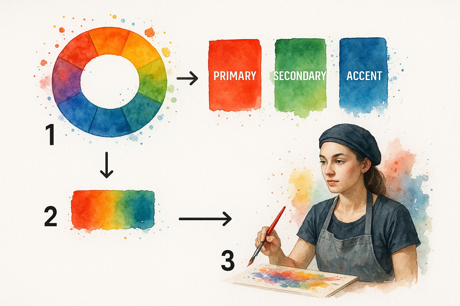
This infographic breaks down how different brand elements, like color palettes and voice, all flow together to create one cohesive identity.
Just like your primary and secondary colors have to work together, your core voice and adaptive tone need to be in harmony to present a strong, unified brand.
Mapping Your Voice Attributes
To make your voice something your team can actually use, you need to define it with a few core attributes. My favorite way to get started is the "we are X, but not Y" framework. It's a simple exercise that provides immediate clarity and draws a clear line in the sand, preventing your brand from straying where it doesn't belong.
Here are a few examples to get you thinking:
Confident, but not arrogant.
Informative, but not stuffy or academic.
Playful, but not silly or unprofessional.
Direct, but not blunt or cold.
Try to land on 3-5 key attributes that truly capture the soul of your brand. These words become the North Star for every single piece of content your team produces. If you want to see how the pros do it, check out these editorial style guide examples from 10 elite brands to see how they wrangle their own voice and tone.
Your brand voice isn't just about the words you choose; it's about the feeling you leave with your audience. A well-defined voice builds trust and turns passive viewers into a real community.
Once you’ve nailed down your core voice attributes, you can map out how the tone should flex across different channels and scenarios. The table below is a practical way to show your team exactly how to apply your brand's personality in various contexts.
Brand Voice and Tone Application
This table demonstrates how a consistent voice attribute, like being "Expert," can be expressed through different tones depending on the channel and audience.
Voice Attribute
Tone on Social Media (Example)
Tone in a Formal Report (Example)
Expert
"Quick tip! Here’s how you can boost engagement in under 5 mins. 🚀"
"Our analysis indicates a significant opportunity for market expansion."
Encouraging
"You've got this! We're cheering you on every step of the way."
"We are confident in the team's ability to execute this strategy."
Witty
"Another Monday? At least there's coffee... and this cool new feature."
"This approach mitigates potential risks while maximizing returns."
Creating a simple chart like this gives your team a practical reference point, taking the guesswork out of how to sound like "us" no matter where they're publishing content.
Crafting Your Visual Identity System
Once you’ve nailed your brand’s personality with voice and tone, it’s time to give it a face. Your visual identity is the sensory shorthand for your brand—it's that unique mix of colors, shapes, and imagery that makes you instantly recognizable in a crowded feed. This system is so much more than just a logo; it's a complete visual language that communicates who you are without you ever having to say a word.
This is where you lock down every single visual element to keep things consistent, whether it's a big-budget video or a simple thumbnail. It's all about making sure your brand looks like your brand, every single time.
Establishing Unbreakable Logo Rules
Think of your logo as the most concentrated version of your brand. Its usage rules need to be non-negotiable. Don't just show your logo; spell out exactly how it should be used and, just as crucially, how it shouldn't.
Your guide must clearly define:
Clear Space: Mandate a "personal bubble" of empty space around the logo. This ensures it never feels crowded or gets lost among other on-screen elements.
Minimum Size: What's the absolute smallest your logo can be while still being readable? Specify this for both digital screens and any potential print use.
Unacceptable Uses: This is huge. Show, don't just tell. Create a visual "don't" list: the logo being stretched, slapped on a busy background, recolored incorrectly, or altered in any way. Seeing it done wrong is often more powerful than just reading a rule.
Defining Your Color and Type Hierarchy
Color hits you on an emotional level. It's powerful, and a consistent color palette is one of the fastest ways to build brand recognition. Your style guide needs to be the single source of truth for every color you use.
Document your primary, secondary, and accent colors with their exact values to remove all the guesswork for your team.
Color Role
Example Use
HEX
RGB
CMYK
Primary
Main backgrounds
#0A192F
R:10 G:25 B:47
C:98 M:89 Y:51 K:64
Secondary
Call-to-actions
#64FFDA
R:100 G:255 B:218
C:51 M:0 Y:31 K:0
Accent
Highlight text
#CCD6F6
R:204 G:214 B:246
C:21 M:13 Y:0 K:0
Next up is typography. A clear typographic hierarchy is what creates visual order and makes your content easy to read. Define the specific font families, weights, and sizes for everything from your main headlines down to the tiniest bit of text in a video caption.
To get a jumpstart on this, check out our free brand style guide template—it’s a great foundation for organizing all this info.
Setting Standards for Imagery and Iconography
Finally, you need to define the look and feel of your visuals. The photos, illustrations, and icons you choose say just as much about your brand as your logo does. Are you going for bright, airy shots filled with genuine human emotion? Or is your vibe more moody, dramatic, and architectural?
Your imagery guidelines should basically be a creative brief for any photographer, illustrator, or designer you work with. It’s how you make sure every single visual asset feels intentional and cohesive.
Getting this right pays off. Organizations with documented guidelines like these see brand recognition improve by up to 70%. They also see workflow efficiency jump by 50%, mostly because they're cutting down on endless revision cycles.
Today, many style guides even use AI tools to keep visual standards current and easy to enforce—a practice now adopted by 78% of companies. You can discover more insights about these style documentation trends to get a sense of their full impact.
Make Your Style Guide a Living Document
Here's the hard truth: a beautiful style guide that just collects digital dust is a failure. The real goal isn't just to create a guide, but to build something your team actually uses and relies on every single day.
This is where the real work begins—making sure it gets implemented and maintained.
The format you choose has a massive impact on usability. Sure, a polished PDF is easy to whip up and share, but it can become outdated almost immediately. For larger teams, especially those pumping out a lot of video content, a dynamic internal hub or a dedicated wiki page is a much smarter play.
The key here is accessibility. If someone has to ask where to find it, you're already losing.
Getting Your Team On Board
Just sending out an email with the subject "New Style Guide" is a one-way ticket to the ignored folder. A successful rollout needs a more thoughtful approach to get real buy-in from everyone, from the video editors to the ad sales team.
Kick things off with a dedicated training session. But don’t just read the rules off a slide—explain the why behind them. Show concrete before-and-after examples that demonstrate how following the guide makes everyone's work stronger and more cohesive.
To really weave it into your daily workflow, try these moves:
Link It Everywhere: Drop a link to the guide in every project brief, creative template, and new-hire checklist. Make it impossible to miss.
Appoint Champions: Find a "brand champion" in each department. This is the go-to person who can answer questions and keep everyone on track.
Showcase the Wins: Regularly share great examples of on-brand content in company-wide comms. Public praise reinforces the value of the guide.
A style guide should be a tool that empowers, not a rulebook that restricts. Its success is measured by how often it's referenced to solve a problem or spark a new idea—not by how perfectly it was written.
Keeping the Guide Fresh and Relevant
Brands change. Trends shift. Your style guide has to keep up. What felt cutting-edge last year can feel stale today. You need a clear process for keeping this document alive and useful.
First, set up a simple feedback loop. This could be a dedicated Slack channel or a quick form where anyone can suggest an update or ask for a clarification. This small step turns your team from passive users into active contributors who feel a sense of ownership.
Next, schedule regular reviews. A quarterly check-in is a great rhythm to see what’s working, what's not, and what new challenges have popped up. This is your chance to add guidelines for a new social platform or refine the tone for an upcoming video series.
For a deeper dive into managing all your brand elements effectively, check out our guide on digital asset management best practices. Committing to maintenance is how you build a style guide that truly lasts.
Got questions about putting together a style guide? You’re not alone. It’s a big undertaking, and it's easy to get lost in the weeds. Let's walk through some of the most common sticking points to get you on the right track.
The main thing to remember is that you're aiming for progress, not perfection right out of the gate.
How Detailed Should My First Style Guide Be?
Your first version doesn't need to be a masterpiece. In fact, it's better if it isn't. The goal is to solve the most pressing consistency issues your team is facing right now.
Think of it as a minimum viable product. A simple, 10-page guide that people actually use is infinitely better than a 100-page encyclopedia that just gathers digital dust.
So, what are the absolute must-haves? Start here:
Logo Usage: The basic do's and don'ts. Where does it go? How much space does it need?
Primary Colors: Just the main hex codes. Your team needs these for everything.
Core Typography: Stick to the fonts for your main headlines and body text.
Basic Brand Voice: A few bullet points on your brand's personality. Are you helpful and professional? Witty and informal?
You can—and should—add more later on. The plan is to iterate. As your brand evolves and the team grows, your style guide will grow with it. This approach keeps the initial task from feeling overwhelming and helps with early adoption.
The best style guide is one that actually gets used. Focus on clarity and usability first. Put out the biggest fires, then build from there.
What Is the Best Format for a Style Guide?
Honestly, the best format is whatever your team will find easiest to access and use. The platform itself matters far less than how little friction there is to get to the information.
For smaller, more agile teams, a well-organized Google Doc or a shareable PDF can be perfect. They're simple, everyone knows how to use them, and they're a breeze to update on the fly.
If you're part of a larger organization, you might need something more robust. This is where a dedicated internal website or a brand management platform comes in handy. The real win here is searchability. When a designer can find the exact hex code or a writer can double-check a tone guideline in seconds, you've made it effortless to stay on brand.
The ultimate test is this: if someone has to hunt for the guide, they just won't use it.
How Do I Get My Whole Team to Use the Guide?
Getting people on board doesn't just happen. You need a game plan. The single most effective way to drive adoption is to build a sense of shared ownership from day one.
Pull in key people from different departments while you're creating it. When the video team, the sales reps, and the marketing crew all have a say, they naturally become advocates for it.
When you're ready to launch, don't just send an email. Hold a real training session and focus on the "why" behind the guidelines. Show them how it makes their work better and their jobs easier.
Finally, weave the guide directly into their workflows. Link to it in project briefs, stick it in creative templates, and make it part of the onboarding for every new hire. When leadership consistently references and champions the guide, everyone else will follow their lead.
Ready to put these principles into action and scale your video content without sacrificing brand consistency? Aeon automates video creation while ensuring every piece adheres to your unique style guide. Discover how Aeon can help.
Share the article
Contributor
Dan Benyamin
Dan served as VP of Data Products at Condé Nast, following their acquisition of CitizenNet, a social media marketing platform he founded.
Unlock the power of video marketing. This guide explains what is video marketing, key formats, and how to build a strategy that drives real business...


.jpg)