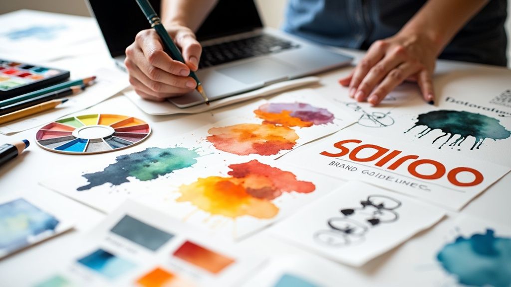
How to Create Brand Guidelines That Actually Get Used
Learn how to create brand guidelines that build consistency and drive growth. Our guide offers real-world advice for building a style guide people will follow.
Dan Benyamin
Sep 19, 2025
In This Article
Subscribe to our newsletter
Let's be honest, "brand guidelines" can sound a bit... restrictive. Like a set of rules meant to stifle creativity. But that's the wrong way to look at it.
Think of your brand guidelines less like a rulebook and more like a strategic playbook. It’s the single source of truth that empowers your team, builds unshakable trust with your customers, and actually drives business growth. It’s how you get everyone—from the new intern in marketing to the veteran in sales—speaking the same language.
Why Your Brand Guidelines Matter More Than You Think
We can all agree that "consistency is key." But that phrase barely scratches the surface of why brand guidelines are a non-negotiable business asset. The real magic happens when you stop seeing them as a design document and start seeing them as a strategic tool.
Their purpose is simple: make your team's jobs easier and your brand stronger. They turn those endless, subjective creative debates ("I don't know, that blue just doesn't feel right") into objective, on-brand decisions.
When everyone has a clear reference point, workflows become incredibly efficient. A new social media manager doesn't have to guess which tone to use in a customer email. A freelance designer doesn't have to reinvent the wheel for every new project. They can act with confidence, freeing up their creative energy for real innovation.
The True Business Impact
Well-defined guidelines don't just streamline your internal world—they have a very real, tangible impact on your bottom line. They are the bedrock of a memorable and reliable brand that people can connect with. In a marketplace this crowded, that connection is everything.
The link between brand perception and what people buy is undeniable. Research shows that 62% of consumers say a brand's values are a major factor in their purchasing decisions. Yet, businesses often only dedicate around 7% of their budgets to actually building the brand. A solid set of guidelines ensures that every logo, every color, and every turn of phrase reinforces what you stand for, building that crucial trust and recognition. You can dive deeper into this in this great article about creating effective brand guidelines.
Think of it this way: Your brand guidelines are the constitution for your brand. They codify your principles and provide the framework for governance, ensuring your brand's integrity is protected as you scale.
Empowering Your Team for Success
Ultimately, the goal is to empower your team to make confident, on-brand decisions every single day, without needing constant hand-holding. A great set of guidelines does exactly that by providing both clarity and inspiration. It helps every team member understand:
The "Why" Behind the Rules: Don't just say "use this font." Explain the strategy behind it. Giving context encourages people to actually buy into the system.
Practical Applications: Show real-world examples. Here's what "on-brand" looks like on an Instagram post, a sales deck, and a trade show banner. Show incorrect usage, too—it's often the fastest way to learn.
Flexibility Within the Framework: Good guidelines define the sandbox, but they don't dictate every castle you have to build. They leave room for creativity within the established boundaries.
This approach is what turns your guidelines from a dusty PDF nobody ever reads into a living, breathing resource that people actually find useful. It’s the first real step in turning a good brand into an unforgettable one.
Defining the Heart and Soul of Your Brand
Before you even dream of picking a color palette or a headline font, you have to look inward. Seriously. The brand guidelines that actually work—the ones that don't just collect dust—are built on a rock-solid foundation of self-awareness. This is where you dig in and define the core identity that gives your brand its personality and its reason for being.
This foundational work isn't just some fluffy, philosophical exercise; it's a strategic must-do. Every single visual and verbal choice you make down the line will flow directly from these core principles. Get this part right, and your team can create work that feels genuine and has a purpose, instead of just looking pretty.
Articulating Your Mission and Vision
Your mission and vision statements are your brand's North Star. Think of them as short, powerful declarations that guide every single decision, from new product ideas to your next marketing campaign. And please, don't treat them like generic corporate jargon destined to be buried on an "About Us" page nobody ever reads.
Here’s a simple way to think about it:
Your Mission is your "what" and "why." It’s a grounded statement about what you do, who you do it for, and the impact you want to have right now. A sustainable coffee company's mission might be: "To source and roast exceptional coffee while empowering our farming partners and minimizing our environmental footprint."
Your Vision is your "where." This is your big, hairy, audacious goal. It’s an aspirational, future-focused statement painting a picture of the world you hope to create. That same coffee company’s vision could be: "A world where every cup of coffee supports a healthy planet and thriving communities."
Nailing these requires some real talk. Get your key stakeholders in a room and ask the tough questions. Why are we really here, besides just making money? What dent do we want to put in the universe? Writing down these answers is the very first step toward creating brand guidelines with real substance.
Uncovering Your Core Values
While your mission and vision set your destination, your core values dictate how you'll get there. These are the non-negotiable principles that guide your brand's behavior, shape your culture, and inform how you treat customers, partners, and your own team.
To find them, think about the times your company was at its absolute best. What principles were you living by? Try to land on three to five core values that truly feel like you. Steer clear of generic words like "integrity" or "innovation" unless you're prepared to define them in a way that is uniquely yours.
Pro Tip: Don't just list your values and call it a day. For each one, write a short, actionable description of what it looks like in practice. For a value like "Bold Creativity," you could add, "We challenge the status quo and aren't afraid to fail in pursuit of a breakthrough idea." This little bit of extra work adds a ton of clarity and kills ambiguity.
That level of detail turns abstract ideas into a practical playbook that anyone in the company can pick up and run with.
Finding Your Brand Archetype
With your mission, vision, and values locked in, you can start shaping your brand's personality using archetypes. Archetypes are basically universally understood characters or story patterns (think The Hero, The Jester, The Sage) that create an instant emotional shortcut with your audience.
So, who are you? Are you The Hero, dead-set on conquering a major challenge? Or maybe you’re The Sage, focused on providing wisdom and truth? Tying your brand to an archetype gives you a powerful framework for defining your voice, tone, and overall story.
Here are a few common ones to get you thinking:
The Explorer: All about freedom, discovery, and adventure (think Patagonia or Jeep).
The Creator: Driven by innovation, imagination, and self-expression (think Apple or LEGO).
The Jester: Lives for the moment with a focus on humor and fun (think Old Spice or M&M's).
The Caregiver: Focused on protecting and caring for others (think Johnson & Johnson or Dove).
Picking an archetype gives you a consistent personality to lean on. It makes sure that whether you’re writing a tweet or designing a billboard, the character of your brand stays consistent and recognizable, strengthening your story with every single interaction.
Building Your Visual Identity System
Once you've nailed down your brand's core mission and values, it's time to give that soul a face. This is where your brand stops being an abstract idea and starts becoming something people can actually see, recognize, and connect with. Your visual identity system is the collection of design assets that work in harmony to create a consistent look across every single touchpoint.
And consistency isn't just about looking sharp; it’s a serious business driver. Recent branding statistics for 2025 show that companies maintaining a consistent brand can boost their revenue by 10% to 20%. When you consider it takes 5 to 7 impressions for someone to even remember a brand, a unified visual system is your best shot at making every single one of those impressions count.
The Cornerstone: Your Logo
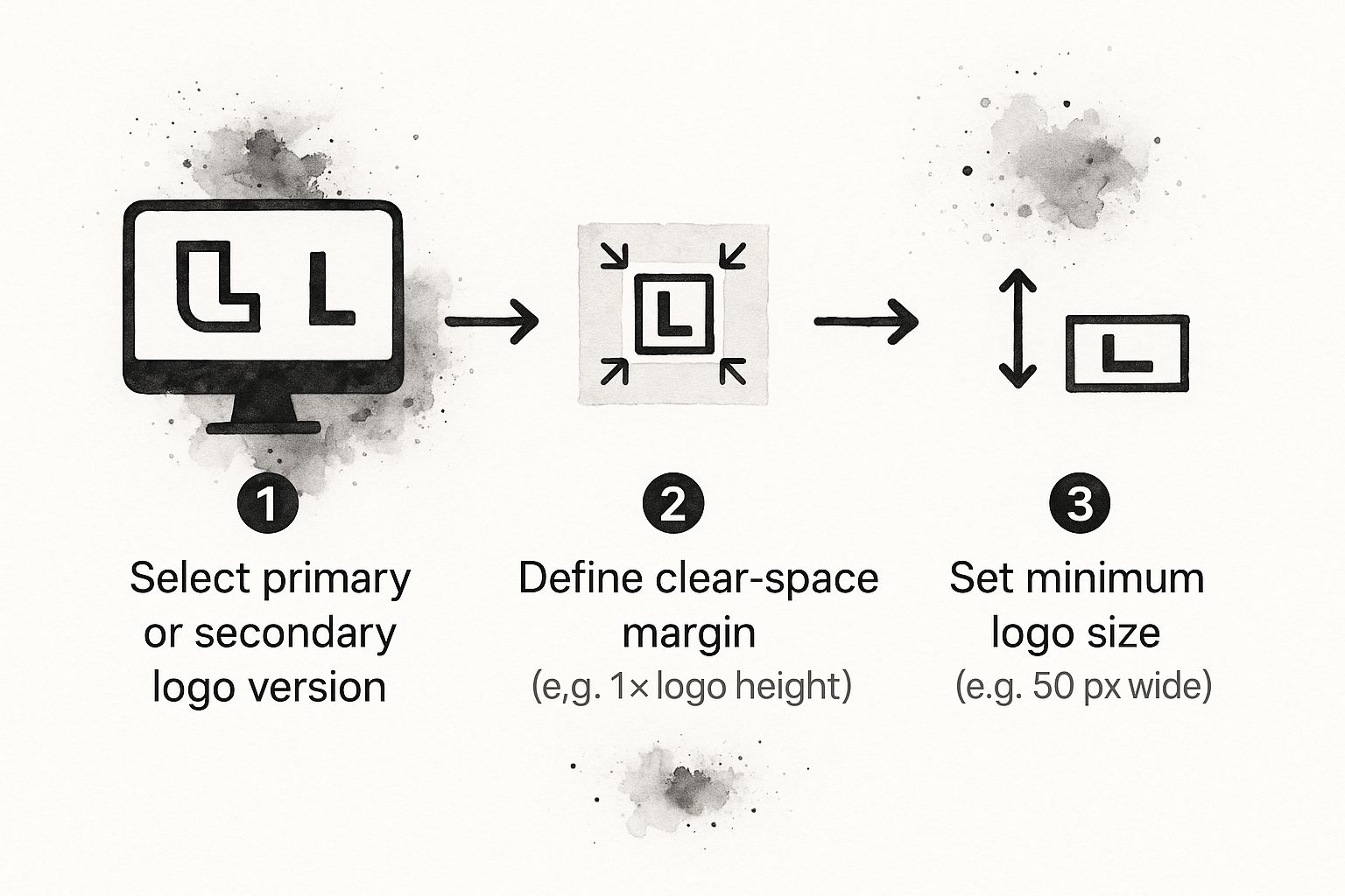
Think of your logo as the most concentrated version of your brand—a visual shorthand people will immediately link to everything you do. Because it’s so vital, your brand guidelines need to be incredibly clear about how it should be used. More importantly, they need to be just as clear about how it shouldn't be.
Start by outlining your primary, secondary, and any other official logo variations. This usually includes a full-color version, a one-color option for tricky backgrounds, and maybe an icon-only mark that’s perfect for a social media profile picture.
Next, you need to set the ground rules for how it’s applied:
Clear Space: This is the non-negotiable "breathing room" around your logo. A common practice is to set a margin equal to the height or width of a specific element within the logo itself. This ensures it never feels crammed next to other text or graphics.
Minimum Size: How small can your logo get before it becomes an unreadable blur? Define a minimum size for both digital (in pixels) and print (in inches or millimeters) to protect its integrity.
Logo Misuse: This is often the most useful part of the logo section. Show clear, visual examples of what not to do. Common mistakes include stretching, rotating, adding drop shadows, or slapping it on a busy background that makes it hard to read.
This simple chart is a great way to visualize the checkpoints every designer or team member should run through to keep your logo looking its best and your brand consistent.
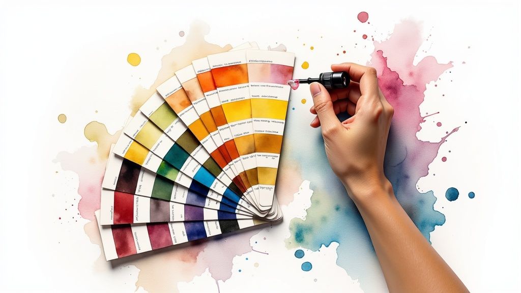
Building Your Color Palette
Color is pure emotion. It’s often the first thing people notice, and having a signature brand color can increase recognition by a whopping 80%. Your guidelines need to lock in a versatile and cohesive color palette that looks great everywhere, from a website to a trade show banner.
A solid palette usually breaks down like this:
Primary Colors: These are the one or two main colors that are quintessentially "you." They should be used the most to build that instant recognition.
Secondary Colors: Think of these as accent colors. They’re perfect for highlighting key information like call-to-action buttons or subheadings, and they should complement your primary colors without stealing the show.
Neutral Colors: This includes your shades of gray, black, or off-white. They’re the workhorses for body text and backgrounds, providing balance to the whole design.
For every single color, you have to provide the specific codes for both digital and print. This takes all the guesswork out of the equation and guarantees perfect consistency.
To keep it all straight, a simple table can be a lifesaver. Here’s a look at the essential visual identity components you’ll want to document.
Core Visual Identity Components
Element
Key Specifications to Document
Why It Matters
Logo
Primary, secondary, and icon versions. Rules for clear space, minimum size, and misuse.
Ensures the brand's primary identifier is always clear, legible, and used correctly.
Color Palette
Primary, secondary, and neutral colors. HEX, RGB, CMYK, and PMS (Pantone) values.
Creates emotional connection and brand recognition. Guarantees color consistency across digital and print media.
Typography
Font families for headlines and body text. Rules for font weights, sizes, line height, and spacing.
Defines the brand's voice and personality, while ensuring all written content is readable and hierarchical.
Photography
Style, mood, subject matter (e.g., people-focused, product shots), and color treatment.
Aligns all imagery with the brand's feel, creating a cohesive and authentic visual narrative.
Iconography
Style (line art vs. filled), stroke weight, and color application rules.
Provides a consistent and professional visual language for user interfaces and instructional graphics.
This level of detail ensures your brand's vibrant blue on the website looks exactly the same on a printed business card. As you pull these pieces together, it helps to understand how to create a comprehensive style guide from the start.
Establishing a Typography Hierarchy
Typography is basically your brand’s voice, but in written form. The fonts you pick say a ton about your personality—are you modern and minimal, or classic and elegant? Your guidelines must establish a clear hierarchy to make sure everything is readable and consistent.
Most brands get by just fine with two or three font families: one for headlines (H1, H2, H3), one for body text (your paragraphs), and maybe a third accent font for special cases like pull quotes.
For each font, you need to specify:
Font Family: e.g., "Montserrat" for headlines.
Font Weights: Define when to use Bold, Regular, or Light. For instance, maybe all H2s must be Montserrat Bold.
Sizing and Spacing: Provide clear rules for font sizes, line heights, and letter spacing. This creates a reading experience that’s easy on the eyes and simple to scan.
Last but not least, every visual you use—from the photos on your homepage to the tiny icons in your app—should feel like it belongs to the same family. Your guidelines need to set the creative direction for all of this imagery.
For photography, define the mood and style you're going for. Should your images be bright and airy, or dark and dramatic? Should they feature people, products, or something more abstract? The best way to do this is to include a few example photos that perfectly capture the "feel."
When it comes to iconography, get specific. Should icons be simple line art or filled in? What should the stroke weight be? Which brand colors can they use? A consistent icon set makes for a clean, professional user interface and subtly reinforces your visual brand at every turn.
Crafting a Voice People Want to Hear
How your brand sounds is every bit as important as how it looks. You can have the most stunning visual identity in the world, but if the words you use are clunky, inconsistent, or just plain off-putting, the whole experience falls apart.
This is where your verbal identity—your brand voice and tone—comes into play. It’s what gives your brand a recognizable personality and builds a genuine, lasting connection with your audience.
Many people toss around "voice" and "tone" as if they're the same thing, but they’re not. Nailing the difference is the secret to building a verbal identity that’s both consistent and flexible enough for the real world.
Voice is your brand's core personality. It’s who you are, and it doesn't change. Think of it as the constant that reflects your foundational values. Are you the authoritative expert, the quirky best friend, or the calm, reassuring guide?
Tone is the mood you strike in a specific situation. It’s how your personality adapts to different contexts and audiences. You wouldn't use the same tone to announce a huge company milestone as you would to apologize for a service outage, but both messages should still feel like they came from the same brand.
It’s just like how you have one personality (your voice), but you speak to your boss very differently than you speak to your best friend (your tone).
Defining Your Unmistakable Brand Voice
To really pin down your brand's voice, circle back to the brand archetype and core values you established earlier. If your brand is The Sage, your voice is probably going to be knowledgeable, clear, and insightful. If you landed on The Jester, you're looking at a voice that's witty, playful, and maybe a little irreverent.
The most effective way I've found to document this is to pick three or four core voice attributes and define them with a simple "we are this, not that" framework. This little exercise is brilliant because it removes all the ambiguity and gives your writers clear guardrails.
Example Voice Attributes
We Are...
We Are Not...
Confident
Arrogant
Approachable
Overly Casual
Insightful
Academic
Passionate
Hypey
This simple table makes your voice tangible. "Confident" tells a writer to speak with authority, but the "not arrogant" part reminds them to stay helpful and grounded. This level of detail is an absolute game-changer when you're trying to scale content creation.
Once your core voice is locked in, you can start mapping out how your tone should shift across different scenarios. This is one of the most practical, rubber-meets-the-road parts of any brand guide because it tackles the real-world situations your team faces every single day.
Create a simple spectrum or a set of guidelines that show how your tone flexes from formal to informal, or from serious to humorous, depending on the context.
The goal isn't to create a different personality for each channel. It's about showing your team how to dial specific aspects of your core voice up or down based on the audience and the situation.
Here’s a quick look at how you might document tonal guidelines for different communication types:
Social Media (Instagram):
Tone: Energetic, conversational, and fun.
Guidelines: Use emojis, ask questions, and jump into the comments to engage with followers. Sentences should be short and punchy.
Customer Support (Email):
Tone: Empathetic, patient, and clear.
Guidelines: Ditch the cleverness and prioritize clarity. Always acknowledge the customer's frustration first, then provide straightforward, actionable solutions.
Formal Press Release:
Tone: Professional, authoritative, and concise.
Guidelines: No slang or overly casual language. Stick to the facts and present them in a structured, direct way.
By providing these specific do's and don'ts, you empower everyone on your team to write with confidence. They'll know they're representing the brand correctly, no matter where they're communicating. This section of your brand guidelines is what ensures your brand truly sounds like itself, everywhere.
Making Your Guidelines Accessible and Usable
You can spend months crafting the most insightful, beautiful brand guidelines the world has ever seen. But if they end up buried in a forgotten folder on a shared drive, they’re not worth much. A brilliant guide that nobody can find or use is just a pretty document.
This is where the rubber meets the road. It's all about implementation and governance—transforming your guide from a static file into a living, breathing tool that people actually want to use. The goal here is to generate excitement, not eye-rolls. Announcing new brand guidelines shouldn't feel like a top-down mandate; frame it as a powerful new resource designed to make everyone's job easier and help the whole company win.
Moving Beyond the Static PDF
For years, the gold standard for brand guidelines was a hefty PDF. It was better than nothing, sure, but the format is riddled with frustrations. They go out of date the minute you save them, they’re a pain to search, and distributing assets becomes a clumsy, manual process of emailing logo files back and forth.
Thankfully, that old way is dying.
The entire approach to brand guidelines is shifting. It’s predicted that by 2025, brand guideline systems will increasingly abandon static PDFs in favor of centralized, hosted platforms. These dynamic tools are a game-changer, allowing for real-time updates, version control, and seamless distribution across teams and vendors.
This isn't just about convenience; it's about sanity. A digital brand hub ensures a freelance designer in another time zone has the exact same approved assets as your in-house marketing team. It's the end of version control nightmares.
Platforms like Frontify and Zeroheight are leading this charge. They turn your guidelines into an interactive, cloud-based hub where everything is current, searchable, and instantly accessible.
Choosing the Right Platform
When you’re deciding where to host your guidelines, think about your team’s daily reality. The best tool is one that slots right into how people already get things done.
Look for a few key things:
Asset Management: Can you store, organize, and distribute all your logos, photos, and icons directly from the platform? This is a massive time-saver. For a deeper dive, check out our guide on digital asset management best practices to optimize your content.
Ease of Use: Is the interface intuitive? If your team needs a two-hour training session just to find a logo, they'll give up.
Scalability: Will the platform grow with you? Think about your needs not just for today, but for a year from now when your brand and team have expanded.
Integrations: Does it play nice with the tools your team already relies on, like Figma, Sketch, or your content management system?
Establishing a Brand Review Process
Creating the guidelines is just the start. To keep them effective, you need a simple, clear governance structure. Don't worry, this doesn't have to be a bureaucratic nightmare. The goal is to create a straightforward system for reviewing work and keeping the brand on track.
First, designate a "brand steward" or a small team responsible for brand governance. This is your go-to person or group for brand questions and the final sign-off on major creative assets.
Next, set up a simple review process. This could be a dedicated Slack channel (#brand-review) or a specific step in your project management tool where new designs are submitted for a quick check. The key is to make it fast and painless, so it becomes a natural part of the workflow rather than a frustrating bottleneck. This simple step ensures your guidelines remain a living document that evolves right alongside your brand.
Common Questions About Brand Guidelines
Even with the best plan, putting together brand guidelines always brings up questions. It's totally normal. You're building the very foundation of your company's identity, and the real work happens when you move from theory to practical application.
Let's dive into some of the most common questions that pop up. Think of this as your quick-reference guide for navigating those tricky spots and making confident decisions.
How Long Should Our Brand Guidelines Be?
There’s no magic number here. A scrappy startup might just need a tight, 15-page deck, while a global behemoth could have a 100+ page digital hub to cover every single use case. The real goal isn't hitting a specific page count; it's about clarity and usability.
Focus on getting the essentials so dialed in that anyone—from a new designer to a freelance copywriter—can pick it up and just get it. At a minimum, you need to cover:
Logo Usage: Simple rules for placement, sizing, and—most importantly—what not to do.
Color Palette: Your primary, secondary, and neutral colors with all the necessary codes (HEX, RGB, CMYK).
Typography Hierarchy: Clear definitions for headlines, subheadings, and body copy.
Brand Voice: The key personality traits that shape how you sound in writing.
Your guide needs to be detailed enough to head off common mistakes but not so dense that people are too intimidated to even open it. Start with these core pillars and add to them as your brand grows and new situations arise.
A brand guide is only useful if people actually use it. Always choose clear, actionable instructions over exhaustive length. If a rule doesn't solve a real-world problem, it probably doesn't belong in your guide.
Should We Hire an Agency to Create Our Guidelines?
This is a classic "it depends" situation, and it really comes down to your internal skills, timeline, and budget. If you have a talented in-house team that lives and breathes the brand, they can absolutely build authentic and effective guidelines.
But bringing in an external agency has its own unique advantages. They offer a much-needed objective perspective, free from attachment to legacy ideas or internal politics. That outside view is incredibly valuable, especially for a new business finding its footing or an established brand going through a major refresh. Agencies also bring a ton of strategic experience to the table, making sure your guidelines are built on a rock-solid foundation. It’s often an investment that pays for itself.
How Often Should We Update Our Brand Guidelines?
Your guidelines should be a living document, not a dusty PDF that gets forgotten on a server. For them to stay useful, they have to evolve right alongside your business.
A good rhythm is to schedule a minor review once a year. This is your chance to tweak anything that isn't quite working, add new examples from recent projects, and make sure the whole document still aligns with your business goals.
Bigger overhauls are usually needed every 3-5 years or when a major business event happens—think a merger, a strategic pivot, or a big shift in who your audience is. The key is to build a process for ongoing management so your brand guidelines never become an outdated relic.
Ready to bring your brand's story to life with video? Aeon is a video creation platform that makes it easy to produce high-quality, on-brand videos from any text, audio, or existing video content. Learn how Aeon can help your team create stunning videos at scale.
Share the article
Contributor
Dan Benyamin
Dan served as VP of Data Products at Condé Nast, following their acquisition of CitizenNet, a social media marketing platform he founded.
Explore 10 powerful multi channel marketing strategies publishers can use to amplify video content, boost engagement, and drive revenue. Learn how to...


.jpg)