If you want to reduce cart abandonment, you have to become a detective. The real solution isn't about applying generic fixes you read in a blog post; it's about diagnosing exactly why your specific customers are leaving your specific store.
It all starts with a deep dive into your analytics to pinpoint where they drop off and slicing up that data to find the hidden patterns.
Understanding Why Shoppers Abandon Carts
Before you can patch the leaks in your sales funnel, you have to find them. Just throwing solutions at the problem without a clear diagnosis is a waste of time and money. The goal isn't just knowing that people leave—it's understanding who is leaving, where they came from, and at what specific point of friction they decided to walk away.
This is where a methodical, data-driven approach really separates the high-growth stores from the ones that just tread water.
The scale of this problem is massive. The global average for cart abandonment hit 70.19% in 2023, meaning seven out of every ten potential sales just vanish. It gets even worse on mobile devices, where the rate skyrockets to an eye-watering 85.65%. For a really solid breakdown of the core issues and what to do about them, check out this guide on proven strategies to reduce cart abandonment. When you realize this adds up to over $4 trillion in lost revenue globally, you start to see the huge opportunity for businesses that actually get this right.
To get straight to the point, here are the most common culprits behind abandoned carts and the quick fixes you can implement.
Top Cart Abandonment Reasons and Actionable Fixes
Here's a quick-glance table of the most common reasons shoppers leave and the immediate actions you can take to address them.
While this table gives you a head start, remember that a true diagnosis requires digging into your own data.
Start Your Investigation with Analytics
Your first stop should be your e-commerce analytics platform, whether that's Google Analytics 4 (GA4) or the reporting tools built into your store's backend. Don't just glance at the overall abandonment number. What you need to do is set up a checkout funnel visualization.
This is a game-changer. It maps out every single step a customer takes, from adding an item to their cart all the way through to hitting "Complete Purchase."
This view will immediately show you your biggest drop-off points. Are you losing half your customers on the shipping page? Is the payment step the real conversion killer? Knowing this is the first critical clue in your investigation.
Key Takeaway: A checkout funnel visualization is your treasure map. It shows you where the problem is, so you can focus your energy on high-impact areas instead of just guessing.
The Power of Customer Segmentation
Once you know where users are dropping off, the next question is who. Not all your customers are the same, and different groups run into different roadblocks. By breaking down your abandonment data, you’ll uncover patterns that a high-level view would completely miss.
Start segmenting your abandoning shoppers by these dimensions:
- Device Type: Compare the abandonment rates between desktop, mobile, and tablet users. If the mobile rate is way higher, it's almost a guarantee that you have a UX problem, like tiny form fields or a clunky payment process.
- Traffic Source: Are visitors from your Instagram ads bailing more often than those from your email list? This could point to a mismatch between your ad creative and the on-site experience, or just a difference in buyer intent.
- New vs. Returning Visitors: If new visitors are leaving in droves, it often signals a lack of trust. They don't know you yet, so they might be spooked by a missing return policy, few customer reviews, or a lack of security badges.
- Geographic Location: International shoppers might be hitting a wall with unexpectedly high shipping costs, confusion over currency conversion, or the absence of familiar, local payment methods.
This diagnostic process is what brings real clarity. It's a simple, three-step framework that lets you move from broad problems to targeted, effective solutions.
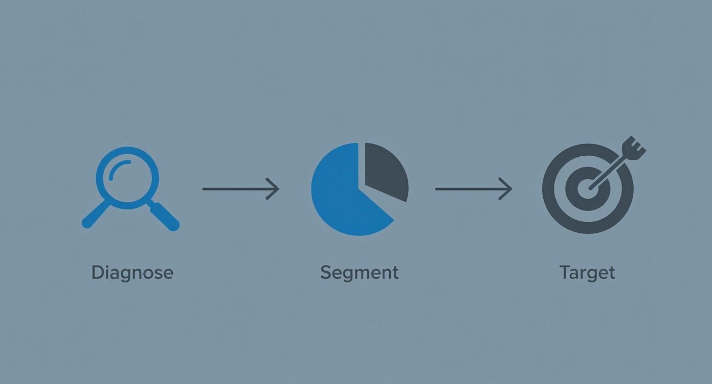
By first diagnosing the friction points and then segmenting the data to understand the audience, you can create surgical solutions that directly address the real problems holding your store back.
Streamlining Your Checkout for a Frictionless Experience
Okay, so you've dug into the data and have a good idea why people are leaving. Now for the fun part: fixing the biggest leak in the bucket, which is almost always the checkout process itself.
Think of a clunky checkout as a locked gate right before the finish line. It doesn't matter how much someone loves your product—if you make that final step a hassle, they'll bounce and find an easier way to buy, probably from your competitor.
Your goal is to make buying from you feel completely effortless. Automatic, even. This means ruthlessly cutting out obstacles, building trust on the fly, and guiding the user smoothly from their cart to that sweet "thank you" page. Every single field they have to fill out, every confusing instruction, and every moment of doubt is another reason to abandon ship.
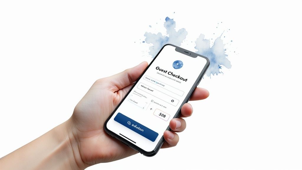
Ditch the Forced Account Creation Roadblock
This one is a classic conversion killer. Forcing a first-time buyer to create an account before they can check out is like asking for a long-term commitment on a first date. It's too much, too soon. They just want to buy something, not sign up for a new relationship with your brand.
The fix is incredibly simple: always, always offer a prominent guest checkout option. Make it the biggest, boldest, most obvious path forward.
Expert Tip: Flip the script and frame account creation as a post-purchase perk. Once the sale is safely in the bank, pop up a simple option: "Want to save your details for next time? Just create a password." You've already got the revenue; now you can work on building that relationship.
Simplify and Streamline Your Forms
Every single form field is a tiny bit of work you're demanding from your customer. Your job is to make that workload as light as possible. A long, intimidating page of empty boxes is a major turn-off, especially on a phone where typing is a pain.
Here are a few high-impact ways to clean up your forms:
- Be a Minimalist: Do you really need their phone number? Scrutinize every single field. If it's not absolutely essential for fulfilling the order, get rid of it.
- Use Autofill and Address Lookups: Make the browser do the heavy lifting. Enable autofill and integrate address validation tools. When someone starts typing their address and a verified suggestion pops up, it saves them time and prevents costly shipping errors from typos.
- Combine Fields Logically: Why have separate "First Name" and "Last Name" fields? Use a single "Full Name" field. It's a tiny change that reduces clicks and makes the form feel shorter.
Show People Where the Finish Line Is
A checkout without a clear endpoint feels like it could go on forever. That uncertainty creates anxiety. Customers want to know where they are in the process and how much is left. This is where a visual progress bar works wonders.
Simply displaying steps like "Shipping," "Payment," and "Review" at the top of the page gives people a sense of control and momentum. As they complete each section and see the bar fill up, it encourages them to push through to the end. This isn't just a checkout trick; it's a fundamental part of a wider strategy for improving your entire site, which you can read more about in our guide to ecommerce conversion rate optimization proven strategies that drive measurable growth.
Get Obsessive About the Mobile Experience
With mobile cart abandonment rates hovering above a staggering 85%, a mobile-first checkout isn't a "nice-to-have"—it's an absolute necessity. What looks fine on a big desktop screen is often a disaster on a small touchscreen.
You need to create a truly thumb-friendly experience.
When you stop treating your checkout as just a transaction form and start designing it as a critical piece of the customer experience, you'll solve many of the core reasons for abandonment. Your goal should be to make giving you money the easiest thing a customer does all day.
Solving Surprise Costs with Radical Transparency
Picture this: your customer is thrilled. They've found exactly what they were looking for, added it to their cart, and they're ready to pull the trigger. They click to check out, start filling in their details, and then—bam. Sticker shock.
A surprise shipping fee or an unexpected tax calculation pops up, and that excitement fizzles out. In that single moment of hesitation, you've likely lost the sale.
This isn't some edge case; it's the undisputed heavyweight champion of cart abandonment. The single biggest reason shoppers bail is because of extra costs that appear right at the finish line. Tackling this isn't just about tinkering with your fees—it's about committing to radical transparency from the second a shopper lands on your site.

This one issue is responsible for a huge chunk of abandoned carts. In fact, studies consistently show that over 50% of consumers will bolt if they get hit with unexpected charges. These last-minute surprises are a bigger deal-breaker than complicated forms or not having enough payment options. The psychological jolt of seeing a price jump by 20% in the final step is a powerful conversion killer. If you want to see the full scope of the problem, check out these global shopping cart abandonment statistics.
Erase Surprises Before the Checkout Begins
The absolute best way to fight cost-related abandonment is to show all potential costs as early and as often as you can. Don't make customers wait until the final payment page to see the full picture.
Key Takeaway: Your goal is simple: the price a customer sees in their cart should be the price they pay. The smaller the gap between expectation and reality, the higher your conversion rate will climb.
Here are a few practical ways I've seen this work wonders:
- Add a Shipping Calculator to the Cart: Put a simple tool right on the cart page where customers can pop in their zip code for an instant shipping estimate. This tiny feature transforms shipping from a scary unknown into a known variable they can factor into their decision.
- Use Geolocation for Estimates: You can use a customer's IP address to automatically detect their rough location and show estimated taxes or shipping costs right on the product pages. Now that's transparency.
- Make Your Shipping Threshold Obvious: If you offer free shipping over a certain amount (like, "Free shipping on orders over $75!"), that message needs to be everywhere. Pin it in a banner at the top of every single page. This flips the script, turning a potential cost into a goal for the customer to reach.
When you show these costs upfront, you're not ambushing your customer. You're making it part of the conversation from the very beginning.
Choosing the Right Shipping Model
Your shipping model has a direct line to your abandonment rate. There isn't a single "best" option here—it all comes down to your products, your margins, and who you're selling to.
Let's break down the most common approaches:
Picking the right one means you have to test. Start with the model that makes the most sense for your business, then run an A/B test against another option to see how it actually impacts your cart abandonment rate.
The Double-Edged Sword of Discount Codes
Everyone loves a good discount, but promo codes can backfire in a big way. When a shopper sees that little "Apply Discount Code" box, they expect it to work. If their code fails, it triggers a moment of intense frustration. It’s no surprise that 50% of shoppers say they'll ditch their cart if a promo code doesn't work.
You have to manage this experience carefully to avoid that friction.
- Auto-Apply Discounts: The best way to avoid user error is to remove the user from the equation. Use link-based promotions from your emails or ads that automatically apply the discount. No typing, no typos, no problem.
- Give Clear Error Messages: Don't just show a generic "Invalid Code" message. Tell them why it failed. "This code has expired," or "Sorry, this code is for first-time customers only" is so much better.
- Offer an Alternative: If a code fails, don't just leave them hanging. Use an exit-intent popup on the checkout page to offer a smaller, universal discount like, "Having trouble? Use code SAVE10 for 10% off your order." This can be just enough to salvage a sale that was about to be lost to frustration.
Building Customer Confidence with Trust Signals and Social Proof
When a customer is hovering over that “Complete Purchase” button, their decision often boils down to a single question: "Do I actually trust this store with my money?"
It doesn't matter how slick your checkout process is. If a shopper feels even a flicker of doubt about your brand's legitimacy or the product's quality, they’ll hesitate. And that hesitation is a conversion killer.
To stop cart abandonment in its tracks, you need to build a fortress of confidence around your customer, starting from the moment they land on your site. This is all about strategically weaving in trust signals and social proof.

This goes way beyond just slapping a security logo in your footer. It’s about creating an environment where shoppers feel so secure and informed that clicking “buy” feels like the most natural next step.
Make Social Proof Impossible to Miss
When people are unsure what to do, they look to others for cues. This is the simple, powerful principle behind social proof, and in e-commerce, it's your best tool for dissolving doubt. Shoppers need to see that real people have bought from you and were genuinely happy they did.
Don't bury this gold on a separate "testimonials" page. Integrate it directly into the buying journey where it has the most punch.
- On Product Pages: This is non-negotiable. Display star ratings right under the product title where they can't be missed. Feature a mix of detailed written reviews and—this is key—user-generated photos or videos showing the product out in the wild.
- Within the Cart: Here’s a pro-level tactic. Drop a small, reassuring snippet from a top review directly in the cart or checkout sidebar. A simple line like, "I was worried this wouldn't fit, but it's perfect!" - Sarah K." can be the final nudge someone needs.
The next evolution of this is already here. New research shows that video-centric social proof is the next frontier in commerce media, and it's an even more authentic and persuasive way to build that critical trust.
Turn Your Return Policy into a Sales Tool
So many brands treat their return policy like a legal chore, burying it deep in the site's footer. This is a massive missed opportunity. A clear, generous, and easy-to-find return policy is one of the most powerful trust signals you have.
Expert Insight: A visible, fair return policy doesn't just reassure customers—it actively boosts conversions. It completely removes the risk of making a bad purchase, giving shoppers the confidence to buy right now because they know there's a safety net.
Think of it as a pre-purchase guarantee. Instead of hiding it, flaunt it. Add a small icon and a line like "Easy 30-Day Returns" right next to the "Add to Cart" button. For fashion brands, consider taking it a step further with "try before you buy" options, which significantly lower the gamble of online shopping, a concept explored in detail when you try before you buy dresses online.
Display Security Badges Where They Matter Most
While a site-wide SSL certificate is standard practice, visual security cues are absolutely vital at the point of payment. This is where shopper anxiety spikes. They're about to type in their most sensitive information, and they need to feel completely safe doing it.
Place the logos of accepted payment methods (Visa, PayPal, Apple Pay) and recognizable security seals (Norton, McAfee) directly on the checkout page itself. Placement is everything here—having them visible right next to the payment fields provides immediate, subconscious reassurance that their data is locked down and protected.
Recovering Lost Sales with Smart Remarketing
Let's be clear: an abandoned cart isn't a dead end. It's a warm lead.
Someone liked your product enough to add it to their cart. They showed real intent. Then life happened—a phone call, a crying baby, a last-minute meeting. Your job isn't to start selling from scratch; it's to gently guide them back to finish what they started.
This is where a smart, automated remarketing system becomes your best friend. It’s your secret weapon for turning near-misses into revenue.
Crafting the Perfect Abandoned Cart Email Sequence
The heart of any good recovery strategy is the abandoned cart email sequence. But this isn't about blasting out a generic "You left something behind!" message. That's just noise.
Instead, think of it as a strategic series of nudges. Each one is designed to remind, persuade, and ultimately convert. Get this right, and it will become a serious revenue driver for your store.
A high-converting sequence really boils down to three things: timing, content, and value.
The first email is the most important, and its timing is everything. Send it too early, and you seem pushy. Too late, and that initial buying impulse is long gone. The sweet spot I've seen work time and time again is 30-60 minutes after abandonment.
This first message should be a simple, friendly reminder. Nothing more, nothing less.
- Subject Line: Keep it helpful and direct. Something like, "Did you forget something?" or "Your items are waiting for you" works perfectly.
- Body: This is critical—show them a picture of the exact items they left behind. Visual recall is incredibly powerful.
- Call to Action (CTA): Use a clear, low-pressure button. Think "Return to Your Cart" or "View Your Items."
The goal here isn't a hard sell. It's just to jog their memory and make it dead simple to pick up where they left off. If you want to dive deeper into crafting messages that people actually open and click, check out our guide on email marketing best practices for higher engagement.
If that first email doesn't do the trick, the second one should land in their inbox about 24 hours later. Now you can start to introduce a bit more persuasion. Address common hang-ups by highlighting your easy return policy, linking to customer support, or showcasing a few top product reviews.
The third and final email, sent around 48-72 hours later, is your last shot. This is the time to bring out an incentive. A modest discount or a free shipping offer can be the final push someone needs to get over their price sensitivity. Just use this tactic carefully—you don't want to train customers to abandon carts just to get a deal.
Pro Tip: Want to really stand out? Use video in your recovery emails. Aeon can help you create short, personalized video messages that show the abandoned products in action. Imagine an email that says, "Here's another look at the [Product Name] you liked," followed by a dynamic, engaging video. It adds a personal touch that static images just can't compete with.
Expanding Beyond the Inbox
Email is a workhorse, but a truly great recovery strategy is multi-channel. You need to meet your customers where they are, using different touchpoints to create a consistent, gentle reminder.
One of the most effective onsite tools is the exit-intent popup. This tech is pretty clever—it detects when a user's cursor is about to leave your site from the cart or checkout page and triggers a last-chance offer. It’s your opportunity to stop abandonment before it even happens.
These popups work best when they offer immediate, tangible value.
- Offer a Small Discount: "Wait! Take 10% off if you complete your purchase now."
- Provide a Free Shipping Code: "Before you go... enjoy free shipping on us."
- Capture Their Email: "Not ready to buy? Save your cart for later."
The key is to make the offer compelling enough to interrupt their exit without being obnoxious about it.
Staying Top of Mind with Retargeting Ads
For shoppers who ignore your emails and popups, retargeting ads on platforms like Facebook and Google are your next line of defense. These ads act as a gentle, visual billboard that follows them around the web, keeping your products top of mind.
The data on this is compelling. Targeted email marketing alone can hit a 39.07% open rate. When you also consider that 41% of shoppers say these reminders influence them to come back and buy, the value is undeniable. These aren't just vanity metrics; they're tactics designed to recover a piece of the estimated $260 billion in lost e-commerce revenue. You can dig into more of this data in this comprehensive analysis of cart abandonment stats.
The best retargeting ads are dynamic, meaning they show the exact products the user left behind. This level of personalization makes the ad feel less like a generic billboard and more like a helpful reminder.
By combining a smart email sequence, timely exit-intent popups, and persistent retargeting ads, you build a robust system that works 24/7 to turn abandoned carts into recovered revenue.
Got Questions? We’ve Got Answers.
Even with a solid game plan, a few common questions always seem to pop up when you're in the trenches fighting cart abandonment. Let's tackle them head-on with some straight-to-the-point advice.
What’s the Very First Thing I Should Fix to Lower My Abandonment Rate?
Go after unexpected costs. Right now. This is, and has always been, the number one reason people bail at the last second. They feel ambushed by shipping fees and taxes they didn't see coming.
Don’t make them wait until the final payment screen to see the real total. You need to get that information in front of them much earlier, preferably right on the cart page.
If you have a free shipping threshold—say, $75—don't hide it. Plaster it across the top of your site in a banner that follows them from page to page. Tackling cost transparency is the quickest win you'll get, and it has an immediate, noticeable impact on conversions. It's all about managing expectations and building trust from the get-go.
What Are the Most Important Metrics to Track Here?
Your overall cart abandonment rate is a fine starting point, but it's a vanity metric. It tells you that you have a problem, but not where or why. To get answers you can actually use, you need to dig into the details.
Focusing on these will give you a much clearer picture of what’s really going on.
- Checkout Abandonment Rate: This number isolates the problem to your actual checkout flow. Are people adding items to the cart and then getting spooked by your shipping or payment pages? This metric tells you.
- Funnel Drop-off by Step: This is where you put on your detective hat. Pinpoint the exact moment they leave. Is it when you ask for their shipping info? The payment form? The "create an account" page? Knowing this lets you stop guessing and start fixing with precision.
- Abandonment Rate by Device: If your mobile abandonment rate is sky-high compared to desktop, you've just found your top priority. It's a massive red flag that your mobile user experience is broken.
- Cart Recovery Rate: This one is all about measuring your comeback strategy. It directly tracks how well your abandoned cart emails and retargeting ads are performing, telling you exactly how much revenue you're successfully clawing back.
Should I Force Users to Create an Account to Check Out?
Absolutely not. Please don't do this. Forcing account creation is one of the oldest and most notorious conversion killers in e-commerce. It throws up a massive wall right when a new customer is ready to give you their money.
Always, always, always offer a "Guest Checkout" option. Make it the biggest, boldest, and most obvious button on the page. Remember, their main goal is to buy your product, not to sign up for a new account and password they'll immediately forget.
My Favorite Pro Tip: Get the sale first, then ask for the relationship. After the payment is confirmed, use the thank you page to offer a simple, no-pressure option like, "Want to save your info for next time? Just create a password." The money is in the bank; now you can focus on building that long-term connection.
How Many Abandoned Cart Emails Should I Send?
The magic number is usually three. One email is too easy to miss, and more than three starts to feel like nagging. A three-part sequence hits that sweet spot between being persistent and just being annoying.
Here’s a cadence that works incredibly well:
- The Gentle Nudge (Send after 30-60 minutes): This is just a simple, "Hey, did you forget something?" email. Show them exactly what was in their cart. Keep it helpful, not salesy.
- The Value Prop Reminder (Send after 24 hours): Time to add a little more persuasion. Remind them why they wanted the product. This is a great place to sprinkle in some social proof, mention your easy return policy, or link to customer support.
- The Final Offer (Send after 48-72 hours): If they still haven't come back, it's time to create a little urgency. A small incentive like a 10% discount or free shipping can be just the push they need to finally click "buy."
This escalating approach gives customers multiple chances to come back on their own terms, respecting their inbox while still working hard to recover the sale.
Ready to turn abandoned carts into powerful video remarketing campaigns that actually convert? Aeon can transform your product catalog into dynamic, personalized videos for email and ads, giving you a unique edge in recovering lost sales. Discover how Aeon makes video simple and scalable.