A brand guidelines template isn't just a document; it's the blueprint for how your business presents itself to the world. Think of it as the shared rulebook for your entire team, ensuring every logo placement, color choice, and social media post sings from the same hymn sheet, reinforcing your core brand message. This kind of consistency is what builds real trust and recognition with your audience.
Why Brand Guidelines Are Your Secret Weapon
Your brand guidelines are much more than a set of rules—they're a strategic asset. They’re what prevent brand confusion and empower everyone on your team to act as a brand steward. Without this shared compass, your brand's look and feel can quickly become fragmented. A designer might use a shade of blue that’s almost right, while a marketer writes social media copy that feels completely off-tone.
These seemingly minor slips add up, diluting your brand’s impact and leaving your audience confused. A solid brand guidelines template cuts through the chaos by creating a single source of truth. It's the difference between a garage band practice and a symphony orchestra—both make noise, but only one creates something truly memorable.
To better understand how these components work together to build a powerful brand, let's look at their specific roles and the value they bring to your business.
Core Components and Their Business Impact
This table breaks down the essential elements of a brand guidelines template and explains the tangible business value each component provides.
By defining these core elements, you're not just creating a style guide; you're building a strategic framework that drives tangible business results, from customer perception to internal efficiency.
Drive Revenue and Build Loyalty
The benefits go far beyond just looking polished. Clear guidelines cultivate a predictable and trustworthy customer experience, which is a direct line to loyalty and revenue. In fact, consistent branding across all channels can increase revenue by 23%. Even more impressive? A mere 5% boost in brand loyalty can skyrocket company profits by an astonishing 95%. The numbers don't lie.
When every interaction—from a sales deck to a social media ad—feels undeniably like you, customers develop a deeper connection and trust in what you bring to the table. If you want to dig deeper into how these guidelines fit into the bigger picture, this guide to a modern B2B brand strategy is a fantastic resource.
Create Efficiency and Empower Teams
A well-crafted brand guidelines template also unlocks massive internal efficiencies. It takes the guesswork out of creative decisions, which means faster workflows and fewer back-and-forth approval cycles. Instead of constantly asking, "Is this the right font?" or "Can we use this logo here?" your team can move forward with confidence and focus on what they do best.
This is especially true for social media, where speed and consistency are everything.
By providing a clear framework for visuals and tone, guidelines ensure every social post reinforces your brand identity, turning followers into advocates.
This unified approach is a game-changer for anyone looking to boost their brand with proven social media engagement strategies. Your guidelines become an empowering tool, enabling everyone—from in-house designers to freelance partners—to represent your brand correctly and effectively, every single time.
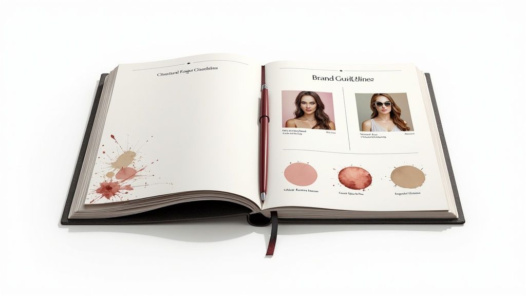
Building Your Core Visual Identity
Now that you've pinned down your brand's "why," it's time to bring that personality to life. This is where you start building the tangible visual system for your brand, turning abstract ideas into the concrete rules that will govern your logo, colors, and fonts. Your template is about to become a real, working tool.
Give Your Logo Clear Rules of Engagement
Your logo is the most recognizable face of your brand. How it's used isn't up for debate, and your guidelines need to make that crystal clear. This is non-negotiable.
First, you need to define its clear space. Think of this as a "personal bubble" or an exclusion zone that must always surround the logo. This ensures it has room to breathe and never gets lost in the clutter. You also have to set a minimum size for both digital and print. This stops it from becoming an unreadable smudge on a business card or a pixelated mess on a screen.
The most effective way I've found to enforce these rules is to show people exactly what not to do. Visual examples of incorrect logo use are often more powerful than a list of "do's."
Here are the big no-no's to include:
- Stretching or squashing the logo's proportions.
- Changing its colors or adding weird gradients.
- Slapping it on a busy background where it's hard to see.
- Messing with the fonts or rearranging the elements.
These "don't" examples stick in people's minds and leave zero room for creative interpretation from your team or outside vendors.
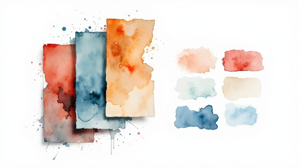
Establish Your Color Language
Color triggers emotion. It’s a powerful, silent communicator for your brand. Your guidelines must lock down your color palette to keep the look and feel consistent everywhere your brand shows up.
Start by defining your primary colors. These are the one or two core colors that will do the heavy lifting and be most associated with your brand. They should be the most prominent colors in your designs.
Next, create a secondary palette. These are your accent colors. They complement your primary colors and can be used for things like subheadings, call-to-action buttons, or other supporting design elements. This gives designers a bit of creative flexibility without veering off-brand.
For every single color in your palette, you must list the exact codes. This precision is what allows a brand to look the same on a screen, in a magazine, and on a billboard.
Make sure you include these codes for every color to ensure total clarity:
- HEX codes for all things web and digital.
- RGB codes for on-screen applications like presentations.
- CMYK codes for anything that's going to be printed.
Once you’ve defined your color palette, you need to make sure those colors translate correctly across different mediums. This is especially true for print, where getting it wrong can be a costly mistake. It's well worth your time to get up to speed on mastering color management in printing.
Select Your Brand Typography
Typography sets the mood before anyone even reads a word. Your brand guidelines need to lay out a clear typographic hierarchy.
Define which fonts are for headlines, which are for body copy, and what can be used for smaller text like captions or quotes. For a more detailed walkthrough on setting this up, check out our free brand style guide template.
This infographic really drives home how creating and using a template like this pays off in both efficiency and brand perception.
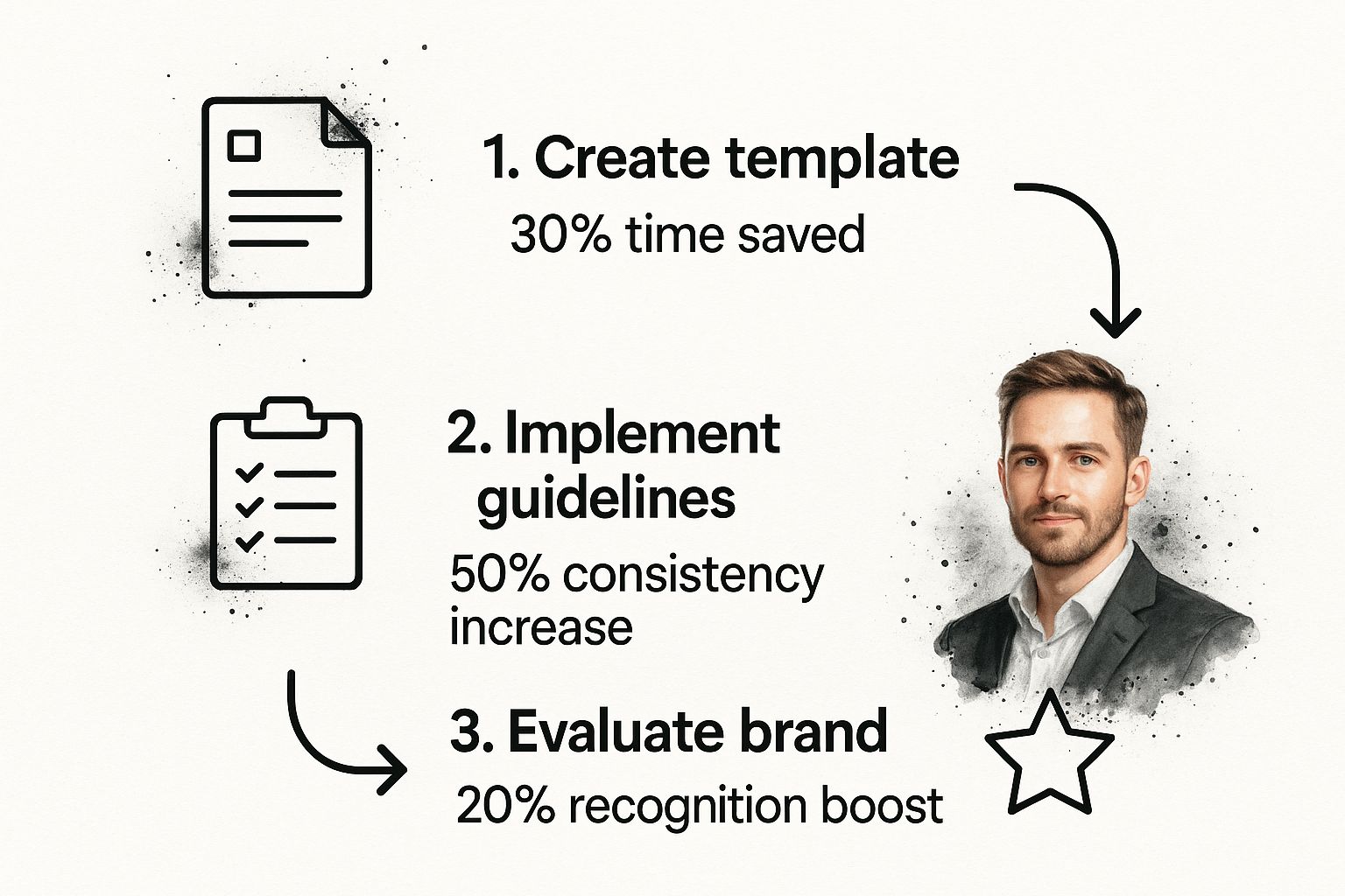
The numbers tell a clear story: taking the time to define these visual rules in a template directly leads to a more consistent and recognizable brand, all while saving your team a ton of time.
Crafting Your Signature Imagery Style
They say a picture is worth a thousand words, but the right picture can communicate your brand’s entire personality in a single glance. It hits faster and harder than any headline. This is where you separate a random collection of photos from a powerful, cohesive visual story. Your brand guidelines are the playbook for making sure every single visual feels intentional and, most importantly, yours.
First things first, you need to define the core principles of your photography. What’s the overarching mood? Are you going for bright, airy, and optimistic, or is your vibe more high-contrast, moody, and dramatic? Your guidelines need to spell this out.
For instance, a tech startup I worked with wanted to feel modern and relatable. Their guidelines mandated photos with a shallow depth of field, focusing on candid shots of people interacting. In contrast, a luxury goods client needed to scream sophistication, so their guide specified minimalist product shots with deep, rich shadows.
Then, think about the subject matter. Are you showing people? If you are, what’s the rule? Should they be polished models staring down the lens, or are you all about candid moments featuring real customers? For a B2B software company, you might feature diverse teams collaborating in bright, modern offices. But for a rugged outdoor brand? That calls for windswept landscapes and people pushing their limits.
Nailing Down Composition and Color
Beyond what’s in the photo, how you shoot it is just as important. Composition is everything. This is where you get specific with your framing rules. Do you favor centered, symmetrical shots to create a feeling of stability and order? Or do you lean into the rule of thirds for more dynamic, engaging visuals? Maybe your signature style is all about using negative space to create a clean, uncluttered aesthetic.
Providing specific examples is non-negotiable here. You have to show a "do this" photo that perfectly nails your desired composition next to a "don't do this" photo showing a common mistake, like a cluttered, distracting background.
Next up is color grading and post-processing. This is the secret sauce that truly unifies your photography. Your guidelines must detail the exact color treatment every single photo gets. Are your brand colors subtly worked into the shadows and highlights? Do all images get a warm, vintage-inspired filter, or do they have a cool, desaturated look?
Be specific. Include details like:
- Saturation: Should colors be vibrant and punchy, or are they more muted and subdued?
- Contrast: Do you prefer high-contrast images for drama or low-contrast for a softer, more approachable feel?
- Temperature: Do your photos lean warm (yellow/orange tones) or cool (blue tones)?
Defining Illustrations and Graphic Elements
Your visual style doesn't stop with photos. It extends to all your illustrations, icons, and graphic elements. These assets need their own chapter in your brand guidelines template.
If your brand’s personality is playful and energetic, you might specify hand-drawn, quirky illustrations with bold, thick lines. A more corporate, buttoned-up brand would likely require clean, geometric vector icons with thin, precise lines.
Your guidelines should lay out the approved icon set, complete with examples and notes on their intended use. This is how you prevent a well-meaning designer from grabbing random icons off the internet that completely clash with your established look.
By creating a clear framework for every visual asset, you empower your entire team—from the in-house art director to a freelance social media manager—to create content that consistently builds and strengthens your brand. No more guesswork.
Finding Your Authentic Brand Voice and Tone
How you say something is just as important as what you’re showing. You can have the most stunning logo and a perfect color palette, but if your words fall flat, you’ll never truly connect with your audience. This is where you go beyond the visuals and define your brand’s personality—the soul of its communication.
The goal is to make sure every tweet, email, and product description sounds like it came from the same person.
So, how do you find that voice? Start by thinking of your brand as a person. If it walked into a room, who would it be? Is it the witty friend who’s always ready with a clever comeback? Or is it more of a calm, reassuring mentor, the one who can break down complex topics and make them simple?
Try to pin this down with a few core adjectives. For example, your brand might be:
- Playful & Energetic: Think slang, emojis, and an easy, conversational style.
- Authoritative & Polished: This means more formal language, avoiding things like contractions.
- Warm & Encouraging: You’re speaking directly to the customer, leading with empathy and support.
This personality is your brand voice. It’s the foundation, and it shouldn't change. Your tone, on the other hand, is all about context. It’s the emotional inflection you use in different situations. You wouldn’t use a super celebratory tone to address a customer complaint, right? The core voice stays the same, but the tone adapts.
Turning Personality into Practice
Once you’ve got a handle on your brand's voice, you need to make it real for anyone who writes for you. This is where your brand guidelines become a playbook for writers, not just a style sheet for designers.
One of the most effective tools I've ever used for this is a simple "Say This, Not That" chart. It takes the guesswork out of it and provides concrete, side-by-side examples.
This little chart instantly clarifies what "informative but not stuffy" or "bold and inspiring" actually sounds like. It transforms an abstract idea into a clear directive that anyone can follow.
Your brand voice needs to be authentic, but it also needs room to breathe. Think of it less as a rigid set of rules and more as a living personality that guides how you connect with people.
Experts agree that modern guidelines need to balance authenticity with flexibility, especially as new digital platforms pop up. Just look at a brand like Liquid Death. They built a massive following by crafting a unique personality and sticking to it, all captured in a solid brand guidelines template. If you want to dive deeper, you can explore the latest in logo and branding strategies.
Finally, don't forget the nitty-gritty details of grammar and style. Get specific. Do you use the Oxford comma? How do you capitalize headlines? Are there industry-specific terms you always use or avoid? Maybe you say "team members" instead of "employees." These small choices add up, creating a cohesive and professional voice that builds trust and makes your brand instantly recognizable.
Building a Usable Brand Guidelines Document

You've nailed down your logo, colors, voice, and imagery. Fantastic. But now comes the part that makes or breaks the whole exercise: packaging all those rules into a resource people will actually use.
A brilliant set of brand guidelines is completely worthless if it just gathers digital dust in a forgotten folder. The real goal is to create a living, breathing document that empowers your team, not a restrictive manual that gets ignored.
The format you choose has a massive impact on how usable your guide will be. Your decision should really come down to your team's size, their technical skills, and just how you all work together.
- The Classic PDF: This is the old standby for a reason. It’s easy to create, share, and print. It’s a solid choice for smaller teams or for giving a static, unchangeable reference to external partners like printers or agencies.
- The Interactive Web Page: If you're a larger, digitally-focused team, a dedicated web page or a section on your intranet is the gold standard. It's searchable, you can update it in a flash, and it can include dynamic content like video examples or instantly downloadable assets.
- The Cloud-Based Document: Using a tool like Google Docs or Notion offers a great middle ground. It's collaborative, easy for anyone to edit, and accessible with a simple link, which is perfect for brands that are always evolving.
Organizing Your Document for Quick Access
Structure is everything. A poorly organized brand guide is a recipe for frustration and, ultimately, people just ignoring it. Put yourself in the shoes of the end-user. A designer on a tight deadline needs to find a specific logo file in seconds. A marketer needs to quickly double-check the approved tone for a social media post.
Always start with a clear table of contents. This lets people jump right to the section they need without the dreaded endless scroll. Then, organize the content logically, moving from the big, foundational elements to more specific, real-world applications.
A common mistake I see is burying the most critical information. Put your most frequently used assets—like primary logos and core color codes—right near the top for immediate access.
Next, make sure your document is the central hub for all brand assets. Don't just show a picture of the logo; provide direct download links to high-resolution files in every format they'll need (PNG, SVG, EPS). Instead of just listing font names, link out to the font files or to a licensed source like Google Fonts. Taking this extra step removes friction and saves everyone a ton of time and headaches.
Making Your Guidelines a Living Resource
For your brand book to truly be effective, you have to treat it as a living document. That means making sure the rules are clear, easy to implement, and shared far and wide. The guide should be accessible to everyone who touches your brand—from internal teams to external agencies, freelancers, and even key partners.
As your brand evolves, your guidelines have to evolve with it. A great way to keep your content fresh and relevant is by showcasing best-in-class examples of your brand in action. For instance, you could include a section on brand storytelling and even show how to transform your story with text-to-video magic to demonstrate how the guidelines apply to modern media formats.
Ultimately, building a usable brand guidelines document is about creating a tool that builds consistency while empowering creativity. When you choose the right format, organize the information logically, and commit to keeping it updated, you ensure your brand's rules become a catalyst for great work, not a barrier to it.
Got Questions About Your Brand Guidelines? We’ve Got Answers.
Even with a solid plan, you’re bound to have some questions when you sit down to create your first brand guide. I’ve been there. Think of this as your quick-reference FAQ, built from years of helping brands navigate this exact process. Let’s clear up the common sticking points so you can finish your document with confidence.
How Detailed Should My Brand Guidelines Be?
This is probably the most common question I get, and the honest answer is: it depends entirely on your team's size and complexity. There’s no single right answer.
If you're a solo founder or a tiny startup, a simple one-pager is often perfect. Just nail down the essentials—your logo, core colors, and go-to fonts. It's a quick cheat sheet that keeps you consistent without getting bogged down in details you don't need yet.
On the other hand, a larger company juggling multiple departments, freelancers, and external agencies needs something far more robust. That version should cover everything from photography and illustration styles to specific, real-world examples of your brand voice.
My best advice? Start with the non-negotiables: logo, color, and typography. You can always build on it from there. The goal is clarity, not creating a 100-page encyclopedia on day one. A guide should grow with your brand.
Can I Use a Pre-Made Brand Guidelines Template?
Absolutely. In fact, starting with a brand guidelines template is one of the smartest things you can do. It gives you a proven structure and acts as a built-in checklist, making sure you don't overlook any crucial elements. Think of it as the perfect blueprint.
But here’s the most important part: you have to make it completely your own. A template is just the starting framework, not the finished product. Your job is to rip out every placeholder and plug in your unique brand assets.
This means you’ll be adding things like:
- Your specific logo usage rules, like required clear space and minimum display size.
- Your primary and secondary color palettes, complete with their exact HEX, RGB, and CMYK codes.
- Your chosen font families and the rules for your typographic hierarchy.
- Your authentic brand voice principles, including helpful "say this, not that" examples.
When you’re finished, the original template should be totally unrecognizable. It needs to feel 100% you.
How Often Should I Update My Guidelines?
Think of your brand guidelines as a living document, not a "set it and forget it" PDF gathering dust in a folder somewhere. I recommend a formal review at least once a year to make sure everything is still relevant and effective.
More importantly, though, you need to update the guide immediately whenever a major brand element changes. This could be anything from a logo refresh or a new product line with its own visual identity to a fundamental shift in your brand strategy.
Here’s a great rule of thumb I’ve learned: pay attention to recurring questions or mistakes. If you see the team making the same design error over and over, that’s a flashing red light. It’s a clear signal that a rule in your guide is either missing or just isn't clear enough.
Who Needs Access to the Brand Guidelines?
The short answer? Everyone who creates anything for your brand. Seriously.
This obviously includes your internal teams—marketing, design, sales, product, and web developers. But it also extends to every single external partner you work with. This means your freelance writers, creative agencies, PR firms, printers, and even the folks who design your booth for a trade show.
Make the document ridiculously easy to find and share. Whether it’s a public link to a cloud document or a dedicated page on your company intranet, eliminate every possible barrier. When everyone works from the same playbook, you build the kind of powerful consistency that makes a brand truly unforgettable.
Ready to bring your brand to life with stunning visuals? Aeon can help you transform your content into engaging videos that perfectly align with your new guidelines. Our platform makes it simple to create high-quality, on-brand video content at scale. Learn how Aeon can work for you.