Getting more of your website visitors to actually buy something comes down to a few core ideas: making your site a pleasure to use, earning their trust, and keeping the checkout process as simple as humanly possible. This means brilliant product photos, a mobile experience that just works, and using your own data to guide your decisions.
Setting the Stage for Sustainable Growth
Before you start tweaking button colors and rewriting headlines, you need to build a solid foundation. Chasing quick wins without understanding your starting point is a recipe for frustration. The goal here isn't a one-off sales spike; it's about creating sustainable growth by truly understanding your customers and your store's performance.
Define What a Good Conversion Rate Means for You
It's tempting to get hung up on industry benchmarks, but a "good" conversion rate is completely relative. It depends on what you sell, who you sell to, and your price points.
Sure, the global average hovers somewhere between 2% and 4%, but that number can be misleading. Personal care products, for instance, often hit rates around 6.8%, while other niches might be happy with 2%. Instead of chasing a number you read in an article, your real focus should be on beating your own past performance.
A high-end watch company might be incredibly profitable with a 1% conversion rate, whereas a fast-fashion brand could need 5% just to keep the lights on. The only benchmark that truly matters is your own.
Master Your Core Conversion Metrics
You can't improve what you don't measure. Diving into your analytics is non-negotiable if you're serious about turning more visitors into customers. Think of it as diagnosing the problem before you start writing prescriptions. You need to find out exactly where your sales funnel is leaking before you can patch the holes.
To get started, let's look at the essential ecommerce metrics that will give you the clearest picture of your store's health. These numbers tell a story about user behavior and pinpoint the biggest opportunities for improvement.
Essential Ecommerce Metrics for Conversion Analysis
Tracking these metrics moves you from guesswork to a data-driven strategy. Every change you make, whether it’s a new product photo or a redesigned checkout page, should be aimed at moving one of these numbers in the right direction.
The infographic below really puts the challenge into perspective.
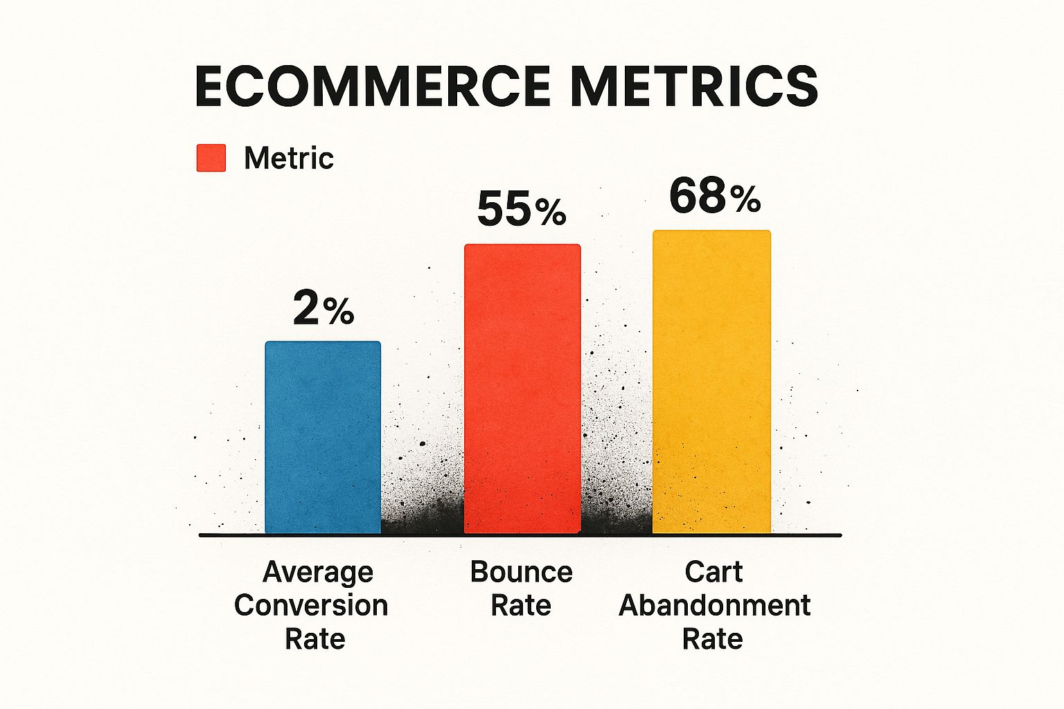
It’s a stark reminder of just how many potential customers you lose to bounces and abandoned carts compared to the small percentage that actually convert. This is where your biggest opportunities are hiding.
By focusing on these core numbers, you move from guesswork to a data-backed strategy. Every change you make should be aimed at moving one of these needles in the right direction. This approach ensures your efforts are both targeted and measurable.
Fixing these leaky buckets in your funnel doesn't just drive more sales today; it builds a better customer experience that pays off in loyalty tomorrow. For more on that, check out our guide on https://project-aeon.com/blogs/top-ecommerce-customer-retention-strategies-to-boost-loyalty. To truly unlock profitable growth, it is essential to continuously explore and implement new strategies to improve ecommerce conversion rates.
Designing Product Pages That Convert
Your product page is where the magic happens. It's the final step before a customer adds an item to their cart, turning a casual browser into a committed buyer. This isn't just a digital catalog entry; it's your most critical sales pitch.
Getting this page right is one of the fastest ways to lift your conversion rates. You need to make shoppers feel confident, informed, and genuinely excited about what they’re about to buy.
Go Beyond Basic Product Shots
Online, your visuals have to do all the heavy lifting. Since shoppers can't touch, feel, or try on your products, your photos and videos need to bridge that sensory gap. High-quality visuals don't just look professional; they build trust.
A single, static photo just doesn't cut it anymore. Your goal should be to visually answer any question a potential customer might have.
- Use High-Resolution, Professional Photos: This is non-negotiable. Clear, well-lit images from every conceivable angle signal quality and attention to detail.
- Enable a Smooth Zoom Function: Let people get up close and personal with the materials and craftsmanship. On mobile, this needs to be a seamless experience, not a clunky, page-breaking hassle.
- Show the Product in Context: Don't just show a couch; show it in a beautifully styled living room. Don't just show a dress on a hanger; show it on a person. Context helps customers imagine the product in their own lives.
- Highlight Unique Features: Use close-ups to draw attention to the texture of the fabric, the quality of the stitching, or the finish on the hardware.
Video takes this to a whole new level. A quick demo can show a product in action, explain its benefits, and forge an emotional connection that static images just can't match. For a deeper dive, our complete guide to product video for ecommerce has everything you need to get started.
Write Descriptions That Sell a Solution
Your product description is more than a spec sheet; it's a sales tool. It needs to tell a story and, most importantly, solve a customer's problem. Remember, people don't buy a drill because they want a drill—they buy it because they need a hole. You need to sell the hole, not the drill.
Exceptional product descriptions answer the customer's unspoken question "What's in it for me?" by translating features into tangible benefits. This simple shift in perspective is a cornerstone of designing product pages that convert.
Structure your copy so it's easy to digest.
- Start with a Benefit-Led Summary: Kick things off with one or two powerful sentences that get right to the core value.
- Use Bullet Points for Key Features: Pull out the top 3-5 most important features into a scannable list. This is perfect for shoppers who are just skimming.
- Tell a Deeper Story: For those who want more, use a few short paragraphs to elaborate. Talk about how the product works, who it’s perfect for, and the story behind it.
This layered approach caters to both the hurried shopper and the detailed researcher, giving everyone what they need to click "Add to Cart."
Weave in Powerful Social Proof
Nothing builds confidence like seeing that other people have already bought—and loved—your product. It’s the digital version of a friend’s recommendation, and it’s incredibly powerful. In fact, 93% of consumers say online reviews influence their purchasing decisions.
Don't hide this valuable content. Integrate it directly onto your product pages where it can have the biggest impact.
- Customer Reviews and Ratings: Place star ratings right near the product title where they can't be missed. Showcase a mix of detailed reviews, showing both the glowing praise and how you professionally handle any constructive feedback.
- User-Generated Content (UGC): There's nothing more authentic than seeing real customers using your products in their own lives. Encourage people to share photos and feature the best ones right on the PDP.
- Real-Time Sales Notifications: Small pop-ups that say "Sarah from Austin just bought this" create a subtle sense of urgency and community, making the purchase feel like a popular, validated choice.
By putting genuine customer experiences front and center, you eliminate doubt and give hesitant shoppers the final nudge they need.
You’ve done all the hard work. You got a visitor to your site, they browsed your products, and they even added something to their cart. They are this close to giving you their money.
And then… they disappear.
Every abandoned cart is a story of a sale that almost was. This is the final, most vulnerable step in the entire customer journey, and the smallest bit of friction can send a would-be customer running for the hills. If you want to find the fastest path to higher conversion rates, your checkout process is the place to start.
The stats are pretty brutal. The average cart abandonment rate hangs around a staggering 70%. That means for every ten shoppers who decide they want your product, seven of them bail before paying. The most common culprit? A clunky, frustrating, or surprising checkout experience.

Ditch the Surprise Costs and Mandatory Accounts
Two of the biggest conversion killers are unexpected shipping fees and the dreaded "Create an Account" wall. A customer might be totally on board with a $50 price tag, but when an extra $10 for shipping suddenly appears at the very last second, it feels like a bait-and-switch. That feeling instantly erodes trust.
It's the same story with forcing users to create an account. Nobody wants another password to remember or another company to manage their data. Adding that step creates a ton of unnecessary mental load right when you should be making things easier.
Transparency is your absolute best friend here. Be completely upfront about all costs on your product and cart pages. And for the love of conversions, always offer a guest checkout option.
Make the Path to Purchase Effortless
Once you've cleared those major hurdles, it's all about making the journey from cart to confirmation as smooth as silk. Every single click, form field, or page load you can eliminate is a direct win for your bottom line.
Here are a few game-changing optimizations:
- Bring in the Express Payments: Integrating digital wallets like Apple Pay, Google Pay, and PayPal is non-negotiable, especially for mobile shoppers. They let customers buy with just a few taps, using info that’s already saved and secured on their device.
- Aim for a Single-Page Checkout: For most stores, getting everything—shipping, billing, payment—onto one screen just feels faster. It reduces clicks and gives the customer a clear view of the finish line. If your orders are more complex, a multi-step checkout can work, but you absolutely need a clear progress bar to manage expectations.
- Get Smart with Your Forms: Use address auto-complete to slash typing and prevent errors. Add a simple checkbox to let customers use the same address for billing and shipping. These tiny details add up to a much faster, less annoying process.
Just imagine a customer buying a last-minute gift on their phone. A guest checkout paired with Apple Pay can take them from the cart to the "Thank You" page in under 30 seconds. That's the kind of frictionless experience that turns browsers into buyers.
Build Rock-Solid Trust at the Finish Line
The checkout page is where you ask customers for their most sensitive information. If anything on that page looks unprofessional or insecure, their internal alarm bells will start ringing, and they'll abandon the purchase. You have to go out of your way to show them their data is safe.
This is where visual trust signals are so important.
- Security Badges: Display well-known logos from security providers like Norton or McAfee, along with SSL certificate seals.
- Payment Logos: Show the icons for every payment method you accept (Visa, Mastercard, Amex, PayPal). It’s a simple visual cue that reinforces your legitimacy.
- Visible Contact Info: Make sure a customer service number or a link to live chat is easy to find. Just knowing that help is available if something goes wrong is incredibly reassuring.
Think of these elements as a digital safety net. A shopper might not consciously notice every single badge, but their absence creates a subtle, nagging feeling of unease. Their presence, on the other hand, screams professionalism and security, giving your customer the final push of confidence they need to hit "Complete Purchase."
By focusing obsessively on speed, transparency, and trust, you can transform your checkout from a leaky bucket into a conversion machine.
Building Unshakable Customer Trust
In e-commerce, trust is the invisible currency that actually powers every single sale. You can have the best products and the slickest marketing, but if a customer doesn't trust you, they simply won't buy. It's that simple.
Think about it from their perspective. A first-time visitor is immediately asking themselves, "Is this a real company? Is my credit card info safe here? What happens if this thing breaks?"
Your entire site needs to be designed to answer these questions before they even have to ask. Building that trust isn't just a box you tick off; it’s woven into every page, every button, and every policy. Nail this, and you won't just see a lift in your conversion rate—you'll create customers who come back again and again.
Make Your Trust Signals Loud and Clear
Trust signals are the little visual cues that tell a shopper, "Hey, you're in a safe place." They're the digital equivalent of a clean, well-lit storefront with friendly staff. They work on a subconscious level to reduce anxiety and make people feel comfortable pulling out their wallets.
But here's the key: don't make people search for them. These signals need to be right where your customers are making decisions.
- SSL Security Badges: You absolutely must have an SSL certificate (that's the "https" in your URL). But don't stop there. Visually reinforce that security with badges from providers like Norton or McAfee, especially on your cart and checkout pages.
- Payment Logos: When people see logos they already know and trust—like Visa, Mastercard, PayPal, and Apple Pay—that trust instantly transfers to you. It's a simple, powerful signal that you're legitimate.
- Airtight Return Policies: An easy-to-find return policy is one of the most effective trust-builders you have. One study showed 92% of consumers will buy again if the return process is easy. Don't just link to it in your footer; feature it on product pages and in the shopping cart.
Trust isn’t just about security badges. It's about being radically transparent. When you’re upfront about shipping costs, return windows, and how you handle data, you eliminate the biggest points of friction that cause people to hesitate.
Craft an About Us Page That Truly Connects
So many online stores drop the ball here. Their "About Us" page is a wasteland of corporate jargon and bland mission statements. This is a huge missed opportunity.
Your About Us page is your chance to tell a real story. It's where you stop being a faceless website and become a group of real, relatable humans. People want to know who they're buying from!
Are you a small team of enthusiasts who geek out over your products? A family business with a quirky origin story? Share it. Put up real photos of your team, not generic stock photos. This human connection creates an emotional bond that a big, anonymous retailer can't replicate, giving shoppers a powerful reason to choose you.
Provide Accessible and Proactive Support
Nothing kills trust faster than needing help and feeling like you're shouting into the void. Visible, easy-to-reach customer support is a powerful safety net for hesitant buyers.
Just knowing that help is a click away is often enough to convince someone to complete their purchase.
A live chat function is a great way to do this. Make it easy to find but not annoying. Even if you only have live agents during business hours, a simple chatbot can answer common questions 24/7. And please, make your contact phone number and customer service email impossible to miss. It shows you stand behind your products and you're not hiding. That simple reassurance is often the final nudge a visitor needs to become a customer.
If you’re still running a one-size-fits-all online store, you’re leaving money on the table. Today's shoppers don't just appreciate a tailored experience; they flat-out expect it. When you make a customer feel seen and understood, you're not just selling a product—you're building a real relationship that will send your conversion rates through the roof.
Personalization is way more than just dropping a first name into an email subject line. It's about creating a dynamic, responsive shopping journey where every single touchpoint feels relevant and genuinely helpful. This is where modern tools, especially AI, have become a game-changer, letting you deliver these bespoke experiences at scale.
Go Beyond "Bestsellers" with Smarter Recommendations
Those generic "what's popular" carousels have their place, but the real conversion magic happens with intelligent, individual recommendations. I’m talking about suggestions based on a user's actual behavior in real-time, not just what everyone else is buying.
Imagine a customer is looking at hiking boots. A smart system doesn't just keep showing them more boots. It understands their intent and suggests things they'll actually need, like moisture-wicking socks, waterproofing spray, or even trail-friendly backpacks. This is context-aware suggestion in action, and it works.
Here’s how you can put this into practice:
- Show them you're paying attention: If a user looks at three different black dresses, your recommendation engine should immediately highlight similar styles, not just random new arrivals.
- Create dynamic bundles: The classic "frequently bought together" tactic gets a major upgrade with AI. Instead of static bundles you create by hand, the system can dynamically create packages based on real purchase data, nudging that average order value up.
- Keep the conversation going: The sale isn't over at checkout. A follow-up email suggesting the perfect accessory for the item they just bought is a personal touch that feels helpful, not pushy.
Turn Your Search Bar Into a Conversion Machine
Your site’s search bar is an untapped goldmine. For a huge chunk of your shoppers, it's the very first thing they interact with. An intelligent, AI-powered search function doesn't just fetch products; it actively guides the customer toward a purchase.
Think about a user who misspells "moisturizer" as "moisterizer." A basic search bar throws up its hands and returns zero results—a total dead end. But an AI-enhanced search uses autocorrect to instantly figure out what they meant and shows them the right products, saving a sale that would have been lost.
An intelligent search experience is like having your best salesperson on the floor 24/7. It anticipates needs, understands typos, and effortlessly leads customers to exactly what they're looking for, turning a simple query into a completed purchase.
Another powerful move is offering personalized search results. If a customer has previously bought from a specific brand on your site, why not prioritize that brand in their future search results? It’s a small tweak that makes the shopper feel understood and smooths their path to becoming a repeat buyer.
Use Location and Context to Stay Relevant
Personalization can also adapt to a user's physical location and browsing context. This adds a layer of relevance that makes your marketing feel incredibly timely, which is a key factor in how to increase ecommerce conversion rates.
For a clothing store, this is a no-brainer. You could automatically show heavy winter coats to someone browsing from a cold climate in November while displaying light jackets to a user in a warmer region. It's a simple, automated adjustment that ensures you're always showing the most appropriate products.
This same logic applies to your promotional offers. You could use data from a style quiz or survey to deliver hyper-personalized discounts that align with their stated preferences. For an even deeper connection, you can convert more with personalized video marketing, sending custom video messages that resonate on a true one-to-one level.
To see how these different tactics stack up, let's break them down.
Comparing Personalization Tactics and Their Impact
Each strategy offers a unique way to connect with your customers. Some are quick wins, while others require a bit more setup but deliver substantial long-term value.
Ultimately, great personalization is about building a feedback loop: you listen to customer behavior, learn from it, and respond with a better experience. When you use data to make the shopping journey easier and more relevant, every visitor feels like the store was built just for them. That level of care doesn't just boost one-time sales—it builds the kind of loyalty that fuels sustainable, long-term growth.
Common Questions About Conversion Rate Optimization
Even with a solid plan in hand, a few questions always seem to surface once you start digging into conversion optimization. Let's tackle some of the most common ones we hear from e-commerce brands trying to get more value from their traffic.
What Is a Good Ecommerce Conversion Rate, Really?
This is the million-dollar question, isn't it? The honest answer is: it depends. A "good" rate is a moving target that shifts based on your industry, what you sell, and your price points.
You'll often hear people throw around a general average of 2% to 4%, but relying on that number can be seriously misleading.
For instance, a bespoke furniture store selling $10,000 tables could be incredibly profitable with a conversion rate of just 0.5%. But a shop selling trendy, affordable phone cases might aim for 5% or even higher to hit their revenue goals.
The best benchmark is always your own past performance. Instead of chasing some generic industry average, focus on making consistent, measurable improvements. Aiming for a 15% lift over your current baseline is a much healthier and more practical goal.
If your rate is 1% today, getting it to 1.15% is a huge win. That's the name of the game: continuous, incremental improvement.
How Long Until I See Results from CRO?
Patience is a virtue in CRO. The time it takes to see meaningful results really depends on two things: how big your changes are and how much traffic you get.
Small tweaks, like A/B testing a button color or changing up your CTA copy, can show statistically significant results in just a few weeks—if you have enough traffic to get a reliable sample size quickly.
Bigger projects are a different beast entirely. Overhauling your entire checkout flow or rolling out a sophisticated personalization engine can easily take several months to build, launch, and properly measure. Think of CRO as a marathon, not a sprint. It's a continuous cycle of testing, learning, and refining your approach over time.
What Are the Biggest CRO Mistakes to Avoid?
It’s easy to get excited and make a few common missteps that can kill your conversion efforts before they even get started. Steering clear of these is half the battle.
The absolute biggest mistake we see? Making changes based on a gut feeling or what a competitor is doing. Every optimization effort needs to start with a data-backed hypothesis you can actually test.
Here are a few other pitfalls to watch out for:
- Testing too much at once. If you change the headline, the main image, and the CTA button all at the same time, you'll never know which change actually made a difference. You have to isolate variables to understand what truly works.
- Forgetting about mobile. The majority of shoppers are on their phones. A clunky, slow, or confusing mobile experience is a guaranteed way to tank your conversion rate. Always think mobile-first.
- Quitting too soon. Not every test is going to be a home run. Sometimes, a test won't produce a clear winner, and that's okay. Every result, good or bad, is a learning opportunity that tells you what not to do next.
Avoiding these traps will ensure your time and budget are actually spent on things that move the needle.
Should I Focus on Getting More Traffic or a Higher Conversion Rate First?
This is a classic chicken-or-the-egg scenario, but the answer is surprisingly straightforward: focus on your conversion rate first.
Why? Because improving your CRO gives you a far better return on your investment by making the most of the traffic you already have. It's like fixing the holes in a leaky bucket before you spend money to pour more water into it.
Think about it: doubling your conversion rate from 1% to 2% has the exact same impact on revenue as doubling your traffic. The difference is, optimizing your site is often much more cost-effective.
Once you’ve turned your store into a well-oiled conversion machine, every single dollar you spend on ads or marketing will work that much harder for you. That’s how you build sustainable, profitable growth.
Ready to turn more of your content into powerful, conversion-driving video? Aeon uses AI to help you create high-quality videos at scale, engaging your audience and boosting sales. Learn how Aeon can transform your content strategy.