Understanding Infographics in Video: When Data Comes Alive

Imagine explaining the global supply chain. Words alone feel…inadequate, right? Like trying to describe a symphony with only hand claps. Now, picture that same complex system brought to life: animated maps illustrating trade routes, lines pulsing with the flow of goods, charts morphing to reflect real-time data. That's the power of infographics in video. They translate dry data into a vibrant story. Viewers instantly grasp complex information, making video infographics a powerful communication tool.
This visual approach is crucial in our information-saturated world. Audiences face a constant barrage of content, and attention spans are dwindling. To cut through the noise, your content needs to be concise, engaging, and digestible. Video infographics achieve this by merging the impact of visuals with the dynamic nature of video. The result? A richer, more memorable learning experience. Think of it as the difference between reading a restaurant menu and watching a chef prepare your meal – both provide information, but the latter is far more engaging.
Why Animated Infographics Matter
Infographics in video, also known as animated infographics, are now a cornerstone of content marketing. Why? Because they make complex information visually accessible. Our brains process visuals 60,000 times faster than text. This makes dynamic, animated data incredibly effective at grabbing and holding attention. Learn more about animated infographics. Viewers quickly absorb key takeaways, even from dense datasets. It’s like seeing a summary chart versus wading through a lengthy report – the chart delivers the core message instantly.
The Power of Visual Storytelling
But what truly sets video infographics apart is their storytelling ability. Through carefully crafted animation, smooth transitions, and clear narration, they guide viewers through the data. Insights unfold step by step, transforming dry facts and figures into a compelling narrative. This deeper engagement helps brands and publishers connect with their audience, fostering understanding and boosting impact. These visual stories also make complex topics accessible to a wider audience, regardless of their background knowledge.
Why Smart Brands Are Going All-In on Animated Data
The rise of infographics in video isn't a passing trend; it's a fundamental shift in how brands connect with their audience. In our fast-paced world, people want information that's easy to understand and engaging. Think about it: a dense report or a quick, animated video summarizing the main points? The video wins every time, and smart brands are catching on.
The Power of Visual Storytelling with Data
Marketing leaders are increasingly seeing the value of animated data storytelling. They're discovering how it surpasses static content, grabbing attention and making complex ideas memorable. Imagine explaining a complicated new product feature. A wall of text might lose your readers, but a dynamic video infographic can bring those features to life, showcasing their benefits in a way that's both informative and entertaining.
The Business Case for Animated Infographics
This move towards video infographics isn't just based on gut feeling; it's backed by real data. Research shows that 89% of consumers worldwide want brands to create more video content, with video infographics a preferred format for grasping complex information quickly. On top of that, 85% of brands now see video as a crucial part of their marketing strategy, understanding that interactive and visually appealing elements like animated infographics boost engagement. Discover more insights on visual content statistics. This isn't just about looking good; it's about meeting audience expectations and getting the most out of marketing investments. Executives are realizing that animated data visualization is a smart financial decision.
Cutting Through the Digital Noise
This increasing demand for video infographics isn't limited to one industry. From finance to healthcare, companies are using animated data to stand out from the crowd. They understand that audience behavior and market dynamics are changing how information is presented and shared. Imagine a financial institution explaining a new investment strategy. A dry presentation might fall flat, but an engaging video infographic can make complex ideas clear, build trust, and ultimately drive sales.
This trend is changing how businesses communicate, making data more accessible and interesting than ever. It shows the power of visual storytelling in a world where attention is a valuable resource.
The Science Behind Why Moving Data Works
There's a fascinating connection between how our minds work and good design when it comes to bringing infographics to life within video. Think about it – you instantly notice something zipping across your field of vision. That's not an accident. We're wired to react strongly to moving visuals. It's a survival instinct, honed over millennia – spotting movement could mean the difference between life and death. Now, content creators use this primal wiring to make data more captivating.
How Motion Captures Attention
Motion graphics play to our innate ability to recognize patterns. Imagine a chart smoothly growing on screen, visualizing rising sales figures. Your brain effortlessly grasps the upward trend. This is much more powerful than static numbers on a page. It’s like the difference between a time-lapse of a plant growing and a single snapshot – the growth process becomes real and memorable. Animation also taps into our love of stories. Video infographics weave narratives with data, turning numbers into characters and trends into plot lines.
Let's see this in action. The infographic below visualizes the difference video infographics make in viewer retention, engagement, and comprehension.
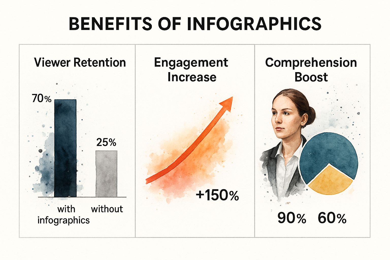
The results are striking. Adding infographics to video boosts viewer retention from 25% to 70%, a dramatic increase. Engagement gets a 150% lift, and comprehension jumps from 60% to 90%. This clearly shows how powerful visual learning is, especially when combined with the dynamism of motion.
Let's dig a bit deeper into how these improvements are achieved. We'll explore the role of effective timing and transitions.
The Art of Timing and Transitions
Skilled creators use timing and transitions like a conductor uses dynamics and phrasing in music. A well-placed pause before a key statistic builds anticipation, like a crescendo. Smooth transitions between related data points create an intuitive flow of information, like a melody guiding the listener.
Visual metaphors add another layer of impact. Showing a rocket launching to represent exponential growth isn’t just about looking cool; it creates a vivid, memorable image that connects with the viewer on an emotional level.
Building Emotional Connections
By blending motion, visuals, and storytelling, video infographics create a strong emotional connection with the data. This deeper engagement transforms passive viewers into active participants. People are more likely to remember and share information that resonates with them emotionally. This shift from passive consumption to active engagement is crucial for making data memorable and driving real impact with your content. It's not just about presenting information; it's about creating an experience.
To understand just how significant the impact of animation can be, let's look at a direct comparison of static and animated infographics. The following table highlights the key differences in engagement metrics.
Static vs. Animated Infographics: Engagement Comparison A detailed comparison showing engagement metrics, retention rates, and sharing behavior between static and animated infographic formats
As this table clearly demonstrates, the addition of animation drastically improves key engagement metrics. The increase in viewer retention, engagement, and comprehension underscores the value of incorporating motion into your infographic strategy. This leads to a more immersive and effective learning experience for your audience.
Real-World Applications That Actually Drive Results
Now that we've explored the potential of adding infographics to your videos, let's see how they're being used to achieve real results in the field. These aren't just theoretical ideas; they're making a tangible difference. Think of video infographics as a high-powered drill in your content toolkit – potent, but you need to know how and when to use it.
From Dry Reports to Engaging Narratives
The financial services industry, often awash in complex data, has embraced video infographics to transform dry quarterly reports into engaging tools for shareholders. Imagine a dense financial report, packed with tables and jargon. Now, picture a concise animated video, clearly highlighting key performance indicators with compelling visuals and a strong narrative. Suddenly, the information becomes accessible, fostering greater understanding and engagement.
Making Learning Stick
Educational organizations are another great example. They’re using video infographics to completely change how complex concepts are taught and remembered. Think about explaining the intricacies of the human circulatory system. A static diagram is informative, but an animated infographic can bring the system to life, showing blood flow, organ function, and how everything works together. This dynamic visual approach makes learning more engaging and dramatically improves knowledge retention.
This screenshot from Canva shows how easily even non-designers can create engaging infographics within their videos.

Canva's user-friendly interface makes it simple to choose templates, add animations, and incorporate data, making video infographic creation accessible to everyone. This democratization of design empowers individuals and organizations to create compelling visuals without needing specialized design skills.
Strategies for Success With Infographics in Video
Many organizations are successfully integrating video infographics into their content. The key is strategy. It’s not just about making things look pretty; it’s about understanding your audience, choosing the right data to showcase, and aligning the visuals with your brand. For example, a tech company explaining a new software product might use a clean, minimalist design to highlight its interface and functionality. A non-profit sharing environmental data might use a more naturalistic aesthetic, incorporating images of nature.
For a more in-depth look at effective video content strategies, check out our guide: Video Content Marketing Strategies That Convert. It offers valuable insights into maximizing the impact of your video content.
From Viral Success to Costly Mistakes
The line between a viral hit and a costly flop often comes down to these strategic choices. A well-made video infographic can boost engagement, drive traffic, and increase brand awareness. But a poorly planned one can be a waste of resources, consuming time and money without delivering results. Think of it like telling a joke—timing and delivery are everything. Similarly, with video infographics, strategic planning and execution are essential for hitting the mark.
Measuring What Matters: Beyond Vanity Metrics
Views and likes… they feel good, right? A little ego boost that tells us our video infographics are reaching people. But let’s be honest, those vanity metrics don’t pay the bills. To truly prove the value of video infographics, we need to dig deeper and understand their impact on the bottom line. Let’s explore how to measure real effectiveness and demonstrate a solid return on investment (ROI).
Identifying Key Performance Indicators (KPIs)
The true power of video infographics lies in their ability to drive tangible business results. Think of your customer’s journey, from the moment they discover your brand to the point of purchase. Where do your video infographics fit into this journey? Are they meant to boost website traffic, capture leads, or directly increase sales?
Pinpointing your goals is the first crucial step. It helps you choose the right metrics to track. For example, if your video infographic showcases a new product, you might track click-through rates to the product page. If it's an educational piece explaining a complex concept, maybe watch time and social shares are better indicators. These actionable metrics paint a much richer picture than just views and likes. They show how your content is actually influencing audience behavior.
Don’t forget about metrics like lead generation, conversion rates, and even customer lifetime value. These directly link video infographic performance to business growth, providing a data-driven view of how your content contributes to overall success. This deeper analysis justifies your investment in animated content.
Tracking the Customer Journey
Understanding the customer’s complete journey is key to measuring the full impact of your video infographics. Where did viewers first encounter your video? Did they come from social media, a blog post, or a paid advertisement? Tracking these source channels reveals which distribution strategies are most effective.
Let's say most of your conversions originate from LinkedIn. That tells you to prioritize LinkedIn for future video infographic distribution. This focused approach optimizes your resources and maximizes your reach to the most receptive audience.
Tracking the entire customer journey also helps identify any roadblocks or drop-off points. This valuable insight allows for continuous improvement and optimization of both your content and distribution strategies.
Speaking of impact, industry surveys reveal that 62% of marketers use interactive content, including video infographics, to improve customer engagement and retention. And campaigns using animated infographics have seen audience retention rates increase by 40-60% compared to static content. Discover more insights on video marketing statistics. That's the power of interactivity at work – captivating and holding audience attention for more impactful campaigns.
Communicating ROI to Stakeholders
Finally, presenting your results clearly and concisely is essential to secure future buy-in for video infographic projects. Focus on the data that resonates with your stakeholders. They're less interested in creative accolades and more focused on bottom-line results.
Use visuals like charts and graphs to showcase key performance indicators. Quantify your successes with concrete numbers to demonstrate the impact. Instead of saying "engagement increased," say "engagement increased by 50%." This data-driven approach makes a compelling case for continued investment and showcases the value of your work.
Video Infographic Performance Metrics: What to Track
The following table outlines essential KPIs for measuring the success of your video infographics, encompassing engagement metrics, conversion rates, and ROI indicators. This will give you a solid foundation for analyzing performance and demonstrating the value of your video content.
By focusing on these key metrics, you can gain a deeper understanding of your video infographic performance and its contribution to your overall business objectives. This data-driven approach helps refine your strategy and optimize your content for maximum impact.
Creating Your First Animated Infographic: A Step-by-Step Journey

This screenshot shows Adobe After Effects, a popular choice for creating polished motion graphics. It's often the go-to software for the kind of animations that make video infographics truly pop. After Effects gives you fine-tuned control, letting you bring data to life with dynamic and visually appealing narratives.
So, you're ready to turn static data into a compelling video infographic. Excellent! It's a bit like planning a road trip. You need a destination (your message), a route (your storyline), and a vehicle (your software). Let’s break down the journey.
Planning and Scripting: Laying the Foundation
First, pinpoint your core message. What story is your data trying to tell? What key takeaways should stick with your viewers? Let's say you’re showing sales growth. Your core message could be, "Our new product X led to a 20% revenue increase this quarter.” This focused approach keeps things concise and prevents information overload.
Next, write a simple script. It doesn't have to be a Hollywood screenplay, just a clear outline of how your information will flow. This is your narrative roadmap, keeping your video on track and ensuring your message hits home.
Visualizing Your Data: Bringing It to Life
With your script in hand, choose a visual style that complements your brand. Are you aiming for a clean, minimalist feel or something more vibrant and illustrative? Keeping it consistent with your existing brand identity makes your video infographic feel like a natural extension of your brand.
Then, choose the right tools. Beginner-friendly platforms like Canva are a great starting point. If you're looking for more advanced animation, software like Adobe After Effects provides extra flexibility. The best choice depends on your budget, technical skills, and the complexity of your animation.
Animation and Sound: Adding the Polish
Now for the exciting part: animation! Start simple and gradually add complexity as you become more comfortable. Consider how each element moves on screen. Seamless transitions between data points help guide the viewer's eye and create a cohesive visual flow. For some helpful tips on making your text stand out, check out our guide on creating engaging video overlay text.
Don't forget the power of sound. The right soundtrack adds another dimension, setting the mood and highlighting important moments. Think of it like a film score—it amplifies the emotional impact of what you see.
Distribution and Measurement: Reaching Your Audience
Finally, think about distribution. Where will your video infographic live? Social media? Your website? Consider your target audience and choose the platforms they use most. Measuring the success of your efforts is crucial, and understanding conversions is key. The Conversions Measurement Guide can help you get started.
Track important metrics like watch time, engagement, and shares to see how well your video is performing. These insights will be invaluable for future video infographics. Remember, creating video infographics is an iterative process. Learn from each project, try new techniques, and constantly refine your approach.
Future-Proofing Your Animated Content Strategy
The digital content world is in constant flux. Instead of chasing every short-lived trend, successful creators build adaptable strategies. Think of it like constructing a house: a strong foundation is key, even if you remodel later. Similarly, understanding core principles is essential for crafting video infographics that endure, even as technology and audience preferences shift.
Embracing Emerging Technologies
What’s next for animated data visualization? Imagine video infographics that react to viewer input, offering personalized data explorations. Interactive elements, enabling audiences to dive deeper, are increasingly prevalent. Think of it like a "choose your own adventure" story, but with data. This transforms passive watching into active discovery.
AI is also reshaping the field. AI-powered tools are simplifying production, automating tasks like animation, and even creating initial infographic drafts. Check out our guide on how AI is transforming video quality to explore the innovative applications of this technology. These tools free creators to focus on the heart of their work: storytelling, visual metaphors, and emotional resonance.
Building a Sustainable Approach
So, how do you create a future-proof content strategy for video infographics? Begin with the fundamentals: clear storytelling, compelling visuals, and a deep understanding of your target audience. These core elements remain vital, irrespective of technological advancements.
When designing animated infographics, file size can be a challenge. Knowing how to reduce video file size is a valuable skill, letting you create high-quality visuals without compromising performance.
Consider the changing landscape of platforms and audience behavior. Mobile-first consumption is the new standard. Ensure your video infographics are optimized for smaller screens. Think concise narratives and crisp visuals that translate effectively on any device.
Balancing Innovation and Proven Techniques
The secret lies in balancing innovation with established practices. Don't discard proven techniques that consistently yield results. Think of it like adding spices to a beloved recipe: a dash of something new enhances the flavor, but the core ingredients are indispensable.
Experiment with new technologies and approaches, but always keep your audience and central message in mind. Ask yourself: Does this innovation truly enhance the storytelling, or is it just a superficial flourish? This mindful approach helps you stay current while delivering real value.
Aeon, a video creation platform designed for publishers, makes it easy to create engaging video infographics. Transform text, video, or audio into dynamic visuals with minimal effort. Explore Aeon and discover how to effortlessly bring your data to life.